Tuesday 26 May 2020

Evaluation

I like my work but i think its pretty similar to the stuff ive produced before. I wanna do something which feels more fresh and crazy to me next time. Ive really struggled with being in lockdown - not to make excuses but my mental health has been all over the place


I had a lot of different ideas - did my own photos, created type, wanted to create physical objects with the water bottle idea, but i didn’t take the ideas very far - this is partly due to not having access to resources.

The work is appropriate for the genre, but could be pushed further

I'm looking forward to next year - I'm going to push myself to my full potential and try to create a much more varied body of work

Final Designs

I am a Berliner

"Ich bin ein Berliner" is a speech by United States President John F. Kennedy given on June 26, 1963, in West Berlin. It is widely regarded as the best-known speech of the Cold War and the most famous anti-communist speech.

Kennedy cast a spotlight on West Berlin as an outpost of freedom and on the Berlin Wall as the communist world’s mark of evil. “Freedom has many difficulties, and democracy is not perfect,” he stated, “but we have never had to put a wall up to keep our people in.”

My idea is to appropriate this phrase onto a flag designed to be used at festivals and parades.


flags are often used by people at festivals to signal to friends where they are in the crowd or mark a camping spot.

Metahaven:

"Metahaven is a graphic design collective based in Amsterdam, Netherlands. Since its launch in 2007, the team — led by Daniel Van der Velden and Vinca Kruk — has pursued collaborations with organizations that traditionally don't seek out graphic design as a platform or medium. Examples include the whistleblower platform WikiLeaks, the Icelandic Modern Media Institute (IMMI), and the diplomatic advisory group Independent Diplomat."


the studio designed a series of scarves for the political activists Wikileaks, who leak information they believe should be public. They say "Scarves are in some sense wearable flags; they can be used to conceal as well as reveal the body and the face."

Flags are inherently political - they are used to signal an opinion, however mild, to others.

Damien Poulian:


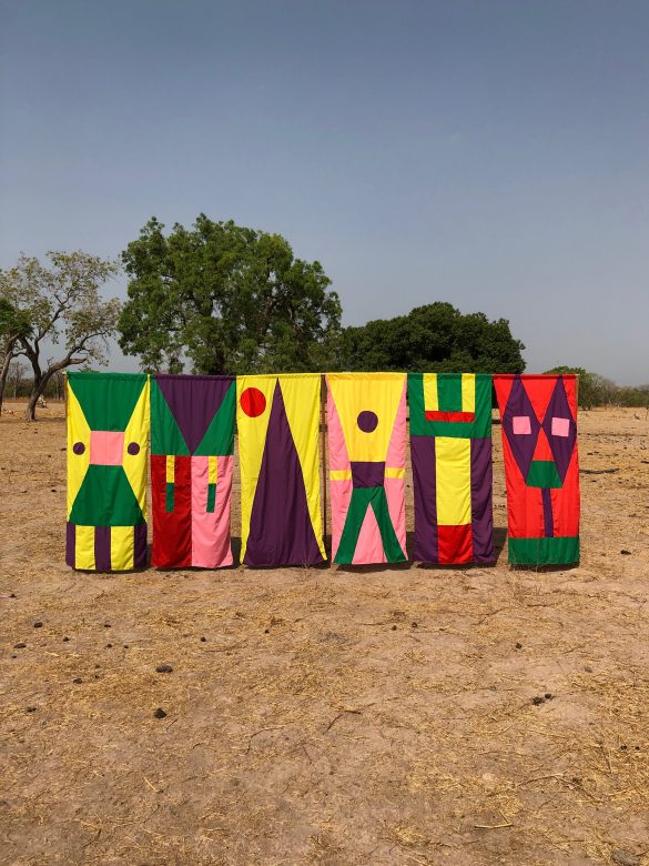
Poulain designs flags to represent community and heritage.


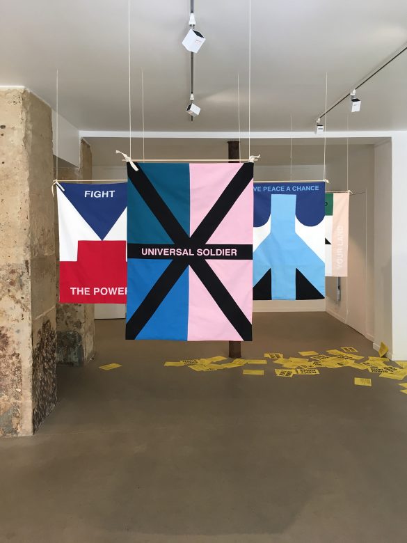
In the above project he explores the relationship between graphic design, pop culture and musical movements.  The flags feature lyrics from songs which define protest movements, such as 'Get up, stand up', from the song by Bob Marley who famously protested against injustice with his music.

My flag has a similar idea behind it in that it represents the social and political opinions from an era and genre of music by using a well known phrase.

Vinyl Design & Stickers


These stickers have been designed to cover smartphone cameras - the small circular ones are the correct proportions to cover most front facing cameras without obscuring too much of the screen, so the user can still use their phone. The rectangular ones are to cover the back camera and have been made larger than necessary to showcase more design, as it doesn't affect the usability of the phone to have some of the back covered.

Sunday 17 May 2020

Flag

im feeling a bit stuck with my album artwork design so instead im going to focus on the design of my flag as well as other elements of the packaging, such as stickers and a plastic baggie to encase the vinyl sleeve.

my idea for the flag is that it will be pretty minimalist and display either a symbol, icon or index to represent the freedom and liberation of Berlin tekno. This symbol/icon or index can also be used as a repeating pattern on the outside baggie to reference the patterns commonly found on drugs baggies:

This Guy Is Charting London's Drug Use with a Discarded Baggie Map ...

flags are often used by people at festivals to signal to friends where they are in the crowd or mark a camping spot.

Wednesday 13 May 2020

Experimental


This album cover is inspired by the graphic design of 'frontpage' magazine, which i discussed earlier in my research. the magazine was created in the 90s and took a 'maximalism' approach with gaudy colours, digitally distorted images and different type faces. The layout follows no logical rules. In theory I like this idea but this quick experiment didn't produce a very impressive result. I think if this idea was chosen to be used it would need to be pushed a lot further.


This cover is more simple, having no type on the front and only 2 images which are vague and distorted. The main focus on the front cover is actually an outtake where I tripped over whilst taking a photo on self timer, but the resulting blurry picture works quite well i representing the hazy experience of clubbing as it captures motion.


This cover invites the viewer to be curious, and uses the same image wrapping around the whole thing.


I really wanted to make this cover by creating my own water bottle packaging and photographing it myself, but I couldn't think of a way I could do this in lockdown as I don't have a printer. Instead I opted for this free mockup which looks really tacky, but communicates my idea to some extent.


Saturday 9 May 2020

Crit

just had an online crit with one of my course mates where we showed each other our work - he suggested moving away from a screen printed end product as it was limiting in terms of what i can produce

i was originally intending to stick with generating work as if it were to be screen printed and then mocking up my final result to look printed but now im thinking of moving away from this.

after looking at my photos he suggested looking at the work of photographer robert maplethrorp, whose work ****

maplethrope shot the cover for patti smith's 'horses'
Robert Mapplethorpe in front of his cover for Patti Smith's Horses ...

crit notes:
Create circuit board tekno type in another way, with chains or something so it adds the punky vibe Extreme crop full colour images of you with gradient mapping to make something cleaner that represent the fetishwear which is less obvious Plastic baggy as an overlay - whole thing in a bag Images in boxes is great - dirty images in clean boxes Contrast dirty punk with clean futurist stuff East vs west Map of Berlin as a grid Fifth element as inspiration Explore mapplethorpe as cleaner photography Elevates dirty to art

Thursday 7 May 2020

Initial Ideas


First mock ups of album artwork - these are for a 2 sided vinyl cover, so the left side is for the back and the right side is for the front - imagine the above images being folded down the middle.


Wednesday 6 May 2020

Type Experiment

Evatronix - Printed Circuits Boards
An Overview of Printed Circuit Boards - DZone IoT
Toward Safer Disposal of Printed Circuit Boards | Printed ...


^ I didn't understand anything in this article but the picture is a vibe


struggling to find naturally occurring letter forms in any of the images of circuit boards i have


illustrator sketch of circuits
- could the dots be placed in relation to the music??