Tuesday 11 May 2021

fake products


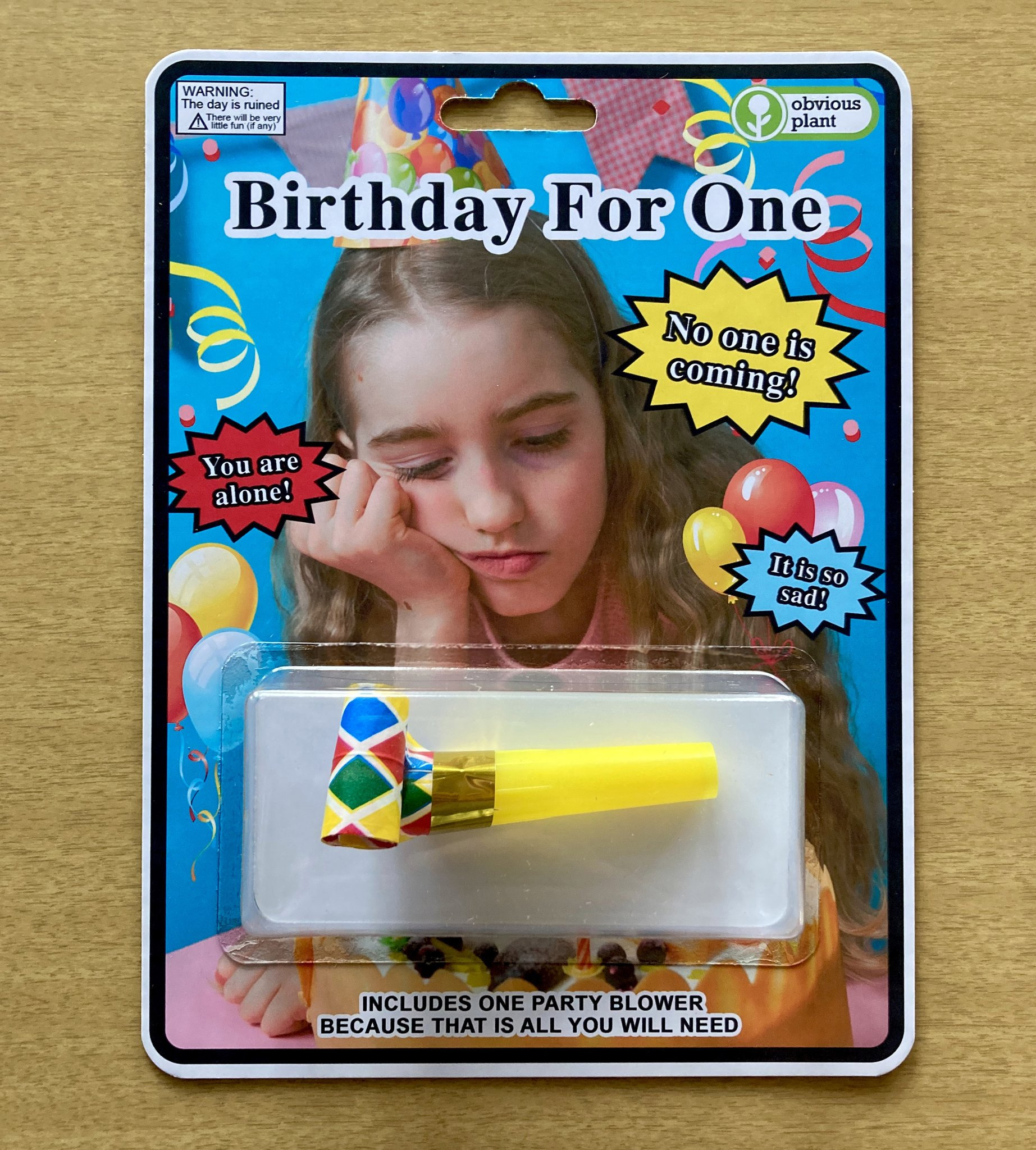
artist obvious plant creates fake products and plants them in real shops to confuse consumers; they use the visual language of real packaging to blend in but add an element of 'somethings off'


brief template


parody and pisstake in art and design

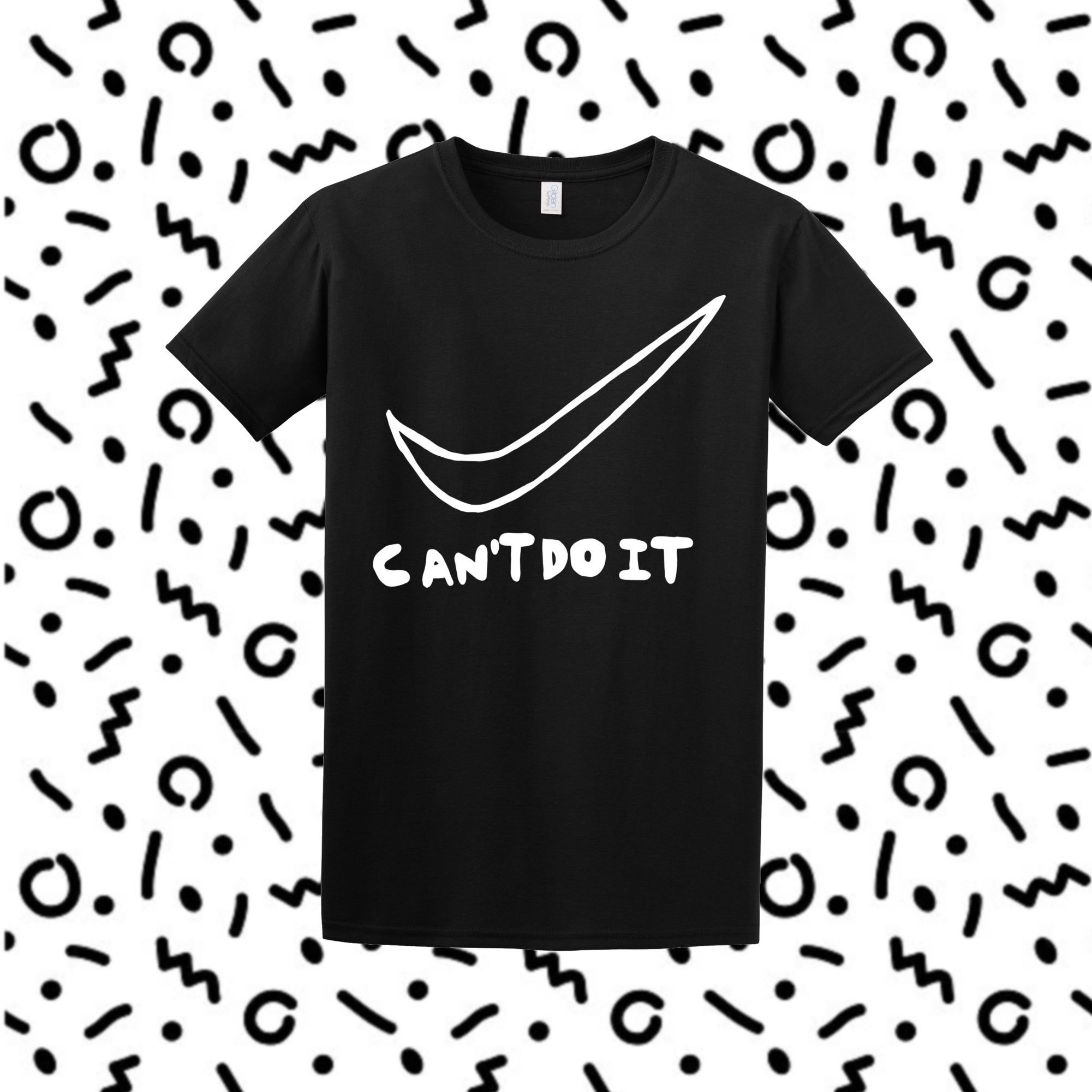
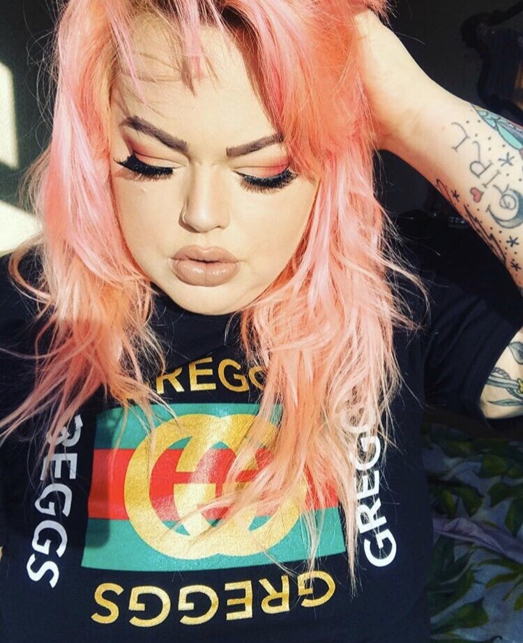
Parody refers to a new creative work which uses an existing work for humour or mockery.

by adopting markers used by what you are attempting to critique, you can highlight how ridiculous something is. Parody can also play homage, in a fun way - it isn't always used to mock.


parody t-shirts are very popular - lots of modern brands mix logos from designer brands and sportswear with references to food, drink, drugs and pop culture. People like them as they're humorous and also can be used as a form of social currency.


additional deliverables

 I mocked up some billboards on photoshop - the first is visibly in America and the second in Japan. This is to express that being overworked is a universal issue. It also shows the globalisation of consumer culture.

The image of the model in the billboards has been digitally manipulated to make her smile bigger - this is not instantly recognisable, but the viewer can tell that something is not quite right with the image - it sits on the edge of the 'uncanny valley', conveying to the viewer that something is not quite right.


Monday 10 May 2021

video graphics - animated


All of these graphics are applied over the video footage. The visual language has been taken directly from my studies of infomercials. The garish red and aggressive messages urge the viewer to consume the product, almost in a threatening way. 


Apart from the photograph of the woman on the phone, he graphic elements were all made from vectors. This meant that they had very clean edges and uniform colour. I flattened them and applied a series of effects such as a slight motion blur and noise to make them more lo-fi and fit in with my retro aesthetic. 


Tuesday 4 May 2021

Video editing

 This project is the second time I've used After Effects for video editing - the first was for the module at the start of this year where I used it to mock up a website. I taught myself pretty much everything I've done on After Effects through youtube tutorials and internet forums - I still have a long way to go but I'm impressed at what I've learnt so far. 

The video shoot was set up with neon orange paper behind the subject to act as a 'green screen' - I didn't have access to green paper so I guess it's an orange screen. This actually worked well because my model wore a green jacket.

I edited out the background in most of the shots to place the subject in different locations. Ideally I would have liked to build sets or shoot on location but due to covid we had limited access to where we could shoot - however I don't mind the obviously edited in backdrops as they add the the feel of something being 'off' with the advert.

above - you can still see and orange haze around the subject and in patches of the background as this is my first time 'green-screening'.


Script prompt to see timings of clip changes:


I used a visual prompt to write the script, so that I could see how much time I had to talk over each scene. I then recorded the audio with a plug in microphone on my laptop. I did several takes to allow myself options when it came to editing. I did my best to sound over enthusiastic.

As you can see, there were about 50 different layers on my composition which I kept organised by colour coding them by file type.


The process of piecing together the video was time consuming but enjoyable. I started by trimming all of my clips and putting them in chronological order. I then edited out the backgrounds and replaced them with either a solid yellow, the same shade as I had used on the packaging design, or with a photo of a backdrop. Ideally I would have loved to create my own backdrops by building and photographing sets - this is something I'm interested in and will hopefully do in the future! 


Instead, I used images found online which fit my retro aesthetic. I next imported my sound files of the narration and placed them appropriately. The last sound file in the clip, which warns the consumer of potential side effects, is sped up in reference to American pharmaceutical adverts. These adverts are known for rushing through medicine side effects at the end, after promising the consumer a solution to all of their problems.

EG


I also added in sound effects, which are easy to find for free online. Next I added in the graphic elements such as the logo and prompts to order the product. Some of these I animated using key frames so that they would move:


I finished by adding a 'VHS' style overlay to the entire video to complete the retro look, and changing the colour grading; before the product appears, the screen is dull and desaturated, where as after it is bright and garish. This is further visual representation to the consumer that the product will improve their life. Tactics like this are often found in real advertising. 


added detail: the phone number the viewers are prompted to call is 0800 (the typical free-phone code) followed by 738 658 8466. On a classic phone, these numbers spell out REVOLUTION. This is a detail most won't notice, but I wanted to include it any way as another hint that this product is actually encouraging the consumer to question the exploitative structure of our society.