Friday, 7 February 2020
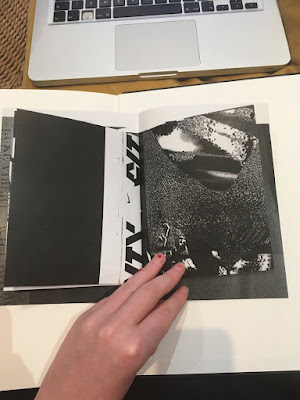
5x5 zine
what are the ideas behind this??
whenever i am feeling stuck/ demotivated i want to pick this zine up and feel inspired
i want to design it in my own style to remind myself of my capabilities
i dont want to imitate the pieces from the designers i am looking at, i am more inspired by their originality and processes
the designers have very post modern maverick approaches, they aren't confined by rules
Thursday, 6 February 2020
zine experiment 1
Monday, 3 February 2020
Type Only
worked on type only covers today -
Exploring the way type can make a reader interpret the text through use of typeface, weight, kerning, italics etc.
as there is so much text on this cover, there was a lot to consider. It was difficult to fit everything on without it looking crowded.
Using hierarchy helps to balance out the large amount of text by signalling what is most important and what order it should be read in.
When typesetting the blurb, i avoided rivers and orphans as these make it look messy and unprofessional. I did this by altering the justification and tracking. I find it easiest to check for rivers by squinting at the paragraph.
Also experimented with colour - by using contrasting colours I found the type covers to be much more attention grabbing than just black and white.
Subscribe to:
Posts (Atom)


