Showing posts with label OUGD405. Show all posts

Monday, 2 March 2020

Module Evaluation

Strengths and weaknesses of the brief

A strength of the brief was having limited book choices - had we been asked to redesign a cover for any book we wanted to, I think I would have probably stayed within my comfort zone. By being forced to choose a book I didn't really have much interest in, I was forced to think more creatively to come up with a solution. It's also good practice for working post uni - in reality, as a graphic designer I will probably be given countless briefs I'm not super passionate about, however that is no excuse for not putting in 100% and producing the best work I can.

What Strategies and ideas used in creating imagery can you use in the future? What do you think are important considerations when creating imagery?

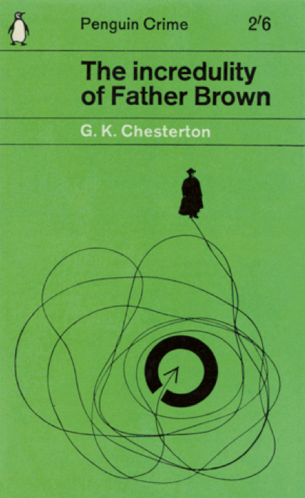
Although it was unsuccessful for this brief, my idea of appropriating imagery from school textbooks could work well in the future - not necessarily textbooks, but by showing a viewer something which is recognisable to them in a different context, this is a good was to pique interest.

Another technique is 'a smile in the mind'. I don't think I was able to achieve this in any of the work I created for this brief, however in the future it is something I will always consider when creating work.

What have you done differently? Have you taken enough risks in this project?


What stage in the design process do you find the easiest/hardest? Why?
I think I find the easiest stage to be researching other designers and analysing their work - I like figuring out what the designer was thinking when they made a piece, how they did it, and how I can apply similar process to my work.
I think the most difficult part of the process for this particular brief was coming up with a concept for the book cover - although I had loads of ideas at the start, none of them were particularly original and it took me a while to come up with a concept I was happy with.

Do you feel you have achieved your potential in this module? How can you improve? What has prevented you from doing your best? How can I address this in future modules?
It is always difficult for me to assess whether or not I have done my best as I am extremely harsh on myself. I am certainly proud of the work I have produced in this module, even though a lot of it is pretty ugly I was able to persevere despite feeling lost several times.

Have you used the facilities available to you?

Yes, although most of my work for this module was digital, I have used different paper stocks, scanners and many random objects found in our room such as string, plastic spoons etc.

Feedback

This module was difficult as it challenged my creative thinking more than my physical skills. It is fairly easy to create a piece of work which is trendy and aesthetically pleasing, but having a fully realised concept takes a lot of time, research and brain-storming. However, I enjoy being pushed to work harder and I think this module succeeded in doing this.

Workload

The workload was manageable for me, I just needed to accept that a lot of the process was going to be time consuming and plan accordingly. I think because I have already completed 2 modules this year, I now know what format they follow and know what to expect. 

Final Cover & Designer Inspiration

I have combined one of my previous ideas with my current type focused idea. By adding in the black hole diagram, it is clear to the viewer that this book has content on space/ science as a whole. I am opting for the neon green on black as it is reminiscent of late 90s/ early 2000s science aesthetic - as the book was originally published in 2003 and scientific advancement has since disproven some of it's content, I think it appropriate to give it a slightly dated yet still contemporary look, to indicate to the viewer this is not a brand new book.

Penguin said they would like to bring this book to a new audience - by opting for such an extreme eye catching cover, I have captured the interests of younger generations for whom this early 2000s CGI aesthetic is all the rage - it can be found in album artwork, all over Instagram, on t-shirts etc...


the work of Raf Rennie often incorporates shapes which look taken straight from retro scientific diagrams.


David Rudnick uses experimental type to create contemporary work with a space age feel to it.


Hassan Rahim uses processing techniques on images such as inverting them and adding texture. This contrasts against the usually black backgrounds of his work.

All of the designer's above produce work which borrow heavily from retro aesthetics but are still clearly contemporary and innovative. By using similar visual language to them,  I have achieved the same effect.


Tuesday, 18 February 2020

Crit

post crit - love my typeface but is it the right vibe? should I push the sophisticated yet still fun angle or g with humour? - group seems to think humour - go with balloon idea. push it further - have balloon on back too. Try putting the typeface on the balloon in vinyl?? it could work, such a long title tho.

I think I want to follow my instinct and explore my typeface further - there must be ways I can make it fit the tone of the book more - try different backgrounds for the cover/ distortion & other processing techniques?

Friday, 14 February 2020

Type Development

Now that I am happy with the type face I have developed for the cover, I am going to experiment with the layout of the type, and once I this is refined I will experiment with applying colour and texture. A lot of the contemporary covers I studied used bold contrasting colours so I would like to experiment with this.

Thursday, 13 February 2020

Type

We did a task where we swapped files with another person doing the same book as us. I was working on Elisabeth's files; she thought her strongest cover designs were the type only ones so I focused on those. After working on Elisabeth's type covers, I reaslised I wanted to focus more on my own typography. I remembered a study task from a different module where I had a made a grid from the golden ratio. I realised I could apply this idea to this current module as the golden ratio appears in nature and maths and is mentioned in the book several times.

Previously, when reading about the Marber grid, I found out that it is based on the 'golden ratio', aka the fibonacci sequence, a concept I explored in an earlier module on type. I thought it might be interesting to try this again and to take it further.

I made a grid of two overlapping fibonacci spirals and sketched out the letters of the title. When I was happy with the letter forms, I created digital versions of them in illustrator. The result is elegant and contemporary, which will hopefully make the book appeal to a younger and cooler audience.


Peer feedback mentioned the designer Eric Hu - I will look into his work to see how I could possibly apply his design principals to my own work.

Tuesday, 11 February 2020

Contemporary Book Cover Design


Na Kim on her process:

We have some form of manuscript pretty much every time. Sometimes it’ll just be a proposal, but usually there’s a first draft read I can read for reference. For fiction I pretty much read the manuscript from start to finish, but with non-fiction I find it easier to work when I have a general outline of what the book is trying to say. Obviously’s it’s harder to work on a book that you don’t like, because you lose interest in it. But it can be equally difficult when you’re really invested in a book personally, and get an idea of what it should look like in your head. If that sketch doesn’t get approved it can be really hard to let go of.

I usually take notes while I’m reading, and I don’t really approach it like a book I would read for fun. You’re looking for things that stand out visually, and can serve as metaphors for events or characters in the book. I try to sum up the book in three words and figure out descriptions that help me start seeing how I want to approach it.

There’s books where you immediately have an idea. You get this one concept, or vision, in your mind, and that can be pretty exciting. There’s a book that will be published in the fall of this year, and it’s a memoir by Tegan and Sara called High School – even just the title can evoke a lot of emotion and moods. That was a book where I had an idea instantly, and really pushed for it, and it happened to work out.


Kafka Covers:

I remember that my first reaction to seeing these covers was one of crushing disappointment. Disappointment caused by the realization that, as a book designer, I could never have arrived at such a brilliant and brave solution.

Launched in 2007, the covers – a collaboration between creative agency Mother, and Penguin Press Art Director Jim Stoddart – feature the work of Gary Card and Jacob Sutton. Crucially, the images were not originated for use on the covers but were created independently by (the now hugely successful) Card and Sutton shortly after graduating from Central Saint Martins. Interviewed recently in Varoom! magazine, Card recalls that the photographs were produced in Sutton’s bedroom and that, at the time they had ‘no idea what we were making’. He isn’t even sure how the images came to the attention of Mother/Stoddart, who repurposed them to such spectacular effect for the series. For Card, now a set designer, it was the first commercial use of his work.

The covers present us with scenarios so thrillingly bizarre, they resonate with even the most superficial awareness of Kafka’s writing – which in my view, is part of their success. As a set of images, they have an almost oppressively flat tone – I can’t help but imagine them to be the documentation of some dangerous form of nineteenth-century institutionalized therapy. There is a sense of deranged urgency about the way the props have been created and applied to the model. The honesty of the materials and the crudeness of the making seemed so progressive compared to the contrived book cover photo shoots I was used to being involved with.

This naïve quality is also reflected in the lettering, which dispenses with the author’s first name and instead presents four variations of hand-generated ‘Kafka’s together with accompanying titles. I’ve always loved that the lettering itself looks vulnerable – it seems to reinforce a sympathetic response to the subject of the images. For me they are a perfect package of playful exuberance, experimentation, creative serendipity and risk-taking, and in an age when we are so quick to tire of visual devices, they have lost none of their freshness.

Large 938bda65 a76f 4fef bee0 d111a0aefe52
Large f8a4dd94 f466 47e2 9363 c0ebebdd28e1
Large 9a0c2590 862d 43f0 88f4 49425c2d0630
Large f9e4136f 731a 4a21 92c9 5ab187e36797

Monday, 10 February 2020

Development

today i was experimenting with balloons again. tried to get action shots of the balloon popping but couldn't capture it on camera. Scanned one of the popped balloons and it ended up looking like a question mark which was a cool coincidence. I am happy to go forward with the balloon concept but feedback from the crit mentioned that the typography needs to be more thoughtful than the current mock ups.

Monday, 3 February 2020

5 ideas to develop

these are my 5 ideas im gonna take to the crit tomorrow
this is why i chose them

Type Only

worked on type only covers today -

Exploring the way type can make a reader interpret the text through use of typeface, weight, kerning, italics etc.
as there is so much text on this cover, there was a lot to consider. It was difficult to fit everything on without it looking crowded.

Using hierarchy helps to balance out the large amount of text by signalling what is most important and what order it should be read in.

When typesetting the blurb, i avoided rivers and orphans as these make it look messy and unprofessional.  I did this by altering the justification and tracking. I find it easiest to check for rivers by squinting at the paragraph.

Also experimented with colour - by using contrasting colours I found the type covers to be much more attention grabbing than just black and white.

Tuesday, 28 January 2020

The Marber Grid

The famous Marber grid is one of the foundation stones of Penguin mythology, a design so clever that it is still studied half a century after it was made.
Romek Marber was a Polish designer working in London. He had done two covers for Penguin when the new art director Germano Facetti invited him and two other Penguin illustrators, John Sewell and Derk Birdsall, to propose a design grid for the crime imprint. Marber won. His approach was very methodical, reflecting his interest in symmetry and proportion:
To retain the unity of the series, the freedom of where to place the title, the logotype and price and in what colour, is controlled by the grid, and routine readers of crime fiction will be able to pinpoint without difficulty the title and author’s name. (Romek Marber)
  This is the design Marber presented to Penguin in 1961. He based his development of the grid on the Golden Section, the ancient formula for well-proportioned designs, especially in architecture. Since the A-format paperback is made in the Golden Section proportions (1 : 1.618) it was a logical starting point.

New Idea

Just had a new idea - look at vintage science textbooks
Bill's interest in science was sparked when he saw a cut away diagram of the earth on his school textbook - but he was disappointed at what was inside
looking at the graphics of vintage science textbooks, these could be used to inform my cover design


also, to appeal to a younger audience - CGP textbooks. most people 27-13 will recognise these from GCSE/ A Level and they are notorious for their tacky illustrations, which are intended to be funny but aren't. Could appropriate some of this imagery and try out different processes on it?
-None of the images are online due to copyright so took photos of my sisters GCSE textbook - will have to abstract the images to avoid intellectual property theft.


Monday, 27 January 2020

A Revelation

i have realised that it is easier to convey adjectives to describe the book in my design work than it is to try and condense all the content of the book into one page. The title of the book is a literal description of it too, so the cover does't need to convey exactly what's inside. As the content of the book is so vast, trying to represent it all in an object wasn't working as they were looking too specific.

Wednesday, 22 January 2020

Chip Kidd

In his TED talk, Kidd talks about his 25 years as a book designer. He says that book covers give the viewer a first impression.

-a book designer gives form to content

-his teacher taught him not to treat the audience as if they're stupid

-kidd talks about his process when designing the iconic cover form Jurassic Park; he didnt have an end goal in mind but rather was just experimenting by tracing an image he found during his research.


-the viewer should look at the book and think 'wow! I NEED to read that!'

-Kidd used 'the opposite of what is expected' in his design for the augusten burroughs memoir 'dry' by throwing water onto the printed typography to create a dripping effect.


-'a book cover is a distillation' - it's the most quintessential representation of maybe 500 pages on only 1 page, it is refined.

- ideas come from the text of the book, but the designer must then become an interpreter and a translator

-book cover design can invite exploration and interaction from the viewer

people say don't judge a book by it's cover but that is impossible, it is human nature to make assumptions based on visual information presented to us. These initial impressions happen in seconds.

Kidd is very literal in his approach. His covers are very minimalistic and to the point.

1 Minute Book Covers

Today we worked in groups of 3 and generated ideas for our book covers. We had all read passages of the book and linked some of our ideas back to specific quotes as well as some coming from the overall theme of the book. We then took photos using modified objects such as wire or porridge. We created several sets of images which could then be used as book covers.

So far, all of my cover designs seem to follow the same format of: image in middle of page with text above and below so I am eager to move away from this and try out some other type methods. 


We decided to make some type from porridge, as Goldilocks is mentioned in the book. We chose to just do the word 'nearly' to highlight it, as this is the word which is stressed most when reading the title.


Whilst I think the idea of creating type from something unconventional is a great approach, I think this just looks really gross and it isn't clear that its porridge.

Tuesday, 21 January 2020

A Smile in the Mind

A smile in the mind refers to the use of visual puns and metaphors in design. The idea is that the viewer will see the design and, although it might not be funny enough to make them laugh, it gives them a brief happy feeling. People like to be in on jokes, and they like to be reassured that they are in the know. These visual puns feed into that.

The 1996 book by Beryl McAlhone and David Stuart features many examples of witty design and elaborates on the problem solving approach the designers took when creating them.


Examples:


These designs employ an unstable figure-ground relationship to show illustrations which at first are perceived as one thing, but then can be seen as another entirely different thing. This is done through using colour and negative space.


Google doodles use the recognisable typography of the Google logo modified by illustrators and designers to celebrate significant cultural and historical dates. To most internet users, the Google logotype is so familiar it is still recognisable even when modified far from it's original form. This gimmick has benefited Google by making them seem fun and more human than corporate.

The book 'A Smile In The Mind' by McAlhone, Stuart, Quinton and Asbury, argues that wit should be a balance of recognition and surprise. Wit is not the same as humour, it is a form of humour which requires existing knowledge to be understood. 


The book explains the benefits of using wit in design. Wit gets the attention of people who are constantly being bombarded with messages. It allows the viewer to participate by decoding the message behind it. It lets the viewer feel rewarded for 'getting' it, and it amuses them, a feeling which people enjoy. By providing amusement, the designer has formed a bond with the viewer. The viewer is likely to feel less hostile toward whatever is being sold to them (because design is generally being used to sell things) when in an amused state of mind. Humour is also memorable to the viewer.


The smile in the mind technique is one approach to book cover design. It can indicate to the viewer the tone/ content of the book whilst also making the book stand out amongst others.


This is a cover design I have seen many times and really like it - it isn't clear from this image, but the design is a classic penguin cover with the title and author - '1984' 'George Orwell' - embossed yet covered by black boxes. An overarching theme of the novel is censorship, and so the information has been censored, however the embossing technique has been used so that a viewer can still identify which book this is. 


This covers is incredibly simple but the more you look at it, the more you can unpack. When first read, it says FEASTING. When read again, you realise it says fasting as the E is crossed out. On closer inspection, you notice the cross is made from cutlery. At this point, it is clear what the book is about, and the eye travels down to the strap line which confirms it.

Penguin Brief - Research

Book: A Short History of Nearly Everything

By: Bill Bryson

'One of the world's most beloved writers'

Published: 2003


Success:

- Best selling
- The book received generally favourable reviews, with reviewers citing the book as informative, well-written, and highly entertaining. 
- won Aventis Prize for best general science book
- won EU Descartes Prize for science communication
- shortlisted for the Samuel Johnson Prize

Author's intentions: 

Bryson wrote this book because he was dissatisfied with his own scientific knowledge. He writes that science was a distant, unexplained subject at school. Textbooks and teachers alike did not ignite the passion for knowledge in him, mainly because they never delved in the whyshows, and whens. Bryson wrote this book in 'layman's terms' in order to make science accessible. 

Target audience:

-Educated but not necessarily expert in scientific fields
-Mature - over 25
-Male & female
-Comfortable income - buying books like this is not high priority to those on lower income unless they have a specific interest in it.

Genre: 'Pop-science' - scientific books for the everyday reader. Consumable to those who are not experts in those fields. See also - pop-sociology, pop-economics, pop-history


Tone: Witty, anecdotal, informal, humorous

'His oft-remarked joie-de-vivre is underpinned by the knowledge that life doesn't last all that long.'
"Bryson uses satire, humour, irony and sarcasm to generate a pace and lucid flow within his writing, and for the reader this can be thoroughly captivating and entertaining. Immediately as the book opens, Bryson establishes an informal and incredibly comic register."

Existing Covers:


This is so horrific that it's almost brilliant, however most people don't share my ironic love of bad design and to most readers this cover probably comes off as looking like a dated school text book. The designer has taken too many concepts from the book - the typography a reference to the playful writing style and the illustration is representative of the content: history of the earth, physics and human history. Also - is the man, who is possibly in reference to the legend of Atlas, seems to be crouching on the moon which adds further confusion.

It's overly complex, with multiple aspects to both the image and the typography, leaving the eye unsure where to focus. The book aims to simplify science for the average consumer, so the cover should represent this and this cover isn't simple. The illustration style is reminiscent of vintage sci-fi novels which, at a glance, is misleading to the viewer.


I appreciate the simplicity of this cover, however it looks boring. I certainly wouldn't be compelled to pick this up in a shop. I appreciate that the designer was trying to be clever with the asterisk element, however it's intention isn't clear. (Or maybe I'm stupid idk). The typeface used looks uptight and stiff, the wide kerning adds to this effect.


This cover is slightly more conceptual. The book talks about the scientific circumstances which lead to the creation of the universe and our Earth, and this cover has appropriated Meccano/ Ikea type instructions as a pun on the creation of the universe. This 'joke' hints at what is contained within the book - technical description presented with humour.


I think that the bisecting of the cover by colour is unnecessary and the typefaces again are boring and stiff. In my opinion, this cover would be better being all one cover with minimal typography and the image being the focal point.


Note every published cover has an image of the Earth - I will explore if there is a way to make this original and contemporary however I imagine I will not end up incorporating it into my final design as it's over-done.


This is a conceptual design from Behance. The board game style grid is a chronological representation of the history of the universe, with key events being represented by vector illustrations. This cover looks very juvenile and falsely gives the impression that this is a children's/ young adult book. This is misleading.


Similar titles:


Another best seller, this title follows a similar narrative to Bryson's work but focuses more on the sociological and anthropological aspects of history. Harari's writing style, whilst being accessible, is more serious. This is represented in the cover through it's balanced hierarchy and typeface.


The hierarchy is employed in order to fit the large amount of type onto the cover without it feeling overcrowded. The typeface chosen could be described as a rounded serif/ Roman style. It is serious but not harsh - conveying that whilst this is a science book, it is still accessible. The use of a human finger print as the tittle on the 'I' is a clear nod to the content of the book which the intended audience will understand.


This cover is beautiful in it's simplicity. The image is abstract but still hints at the scientific content of the book - visually, it could be representative of a black hole, the sun, a planet etc... The use of colour is striking without being garish. The cover is understated and respectful in its presentation of Hawking's work.


The lines used on the cover are in reference to the common way of drawing family trees. This, combined with the title, is an obvious reference to what the book is about. The combination of typography and diagram is clever, it clearly conveys the message and looks minimalist and modern. I'm unsure of the intention behind the rainbow colouring of the lines, however after imagining them in black, I agree with the use of colour in order to separate them from the text and keep it easily legible.


Contemporary book cover design - non-fiction:


The designer Greg Heinemann said the cover design was “inspired by the posters used in the American civil rights movement of the 1960s, which featured black text in capital letters on white backgrounds”
This is a very bold use of typography. The black and white links to the racial issues on which the book focuses.
The cover utilises negative space as it's main design principle.


This cover design uses a single item to indicate the content. The burberry cap became a symbol of the 'chav' stereotype of working class people. It is a recognisable to most British people in a cultural context. The red is a bit overbearing although it could be argued that it represents the 'angry' tone of the book.


The use of contrasting colours and roughly separated into thirds - balancing the cover
reference to Saul Bass's classic film posters in the cut out style and pointing hands.
Jaunty angles refers to humorous yet anxiously sarcastic writing style

Other titles by Bryson:


-humour nostalgia 'british' humour gentle mocking


Market research - Waterstones:


Waterstones is a leading UK book shop. I visited the Leeds branch, which has 3 floors, to pick up a copy of 'A Short History of Nearly Everything'. Whilst there I looked at other titles in the 'popular science' category to analyse competition and seek inspiration.


The designer used the same colours associated with the 'never mind the bollocks' album by the sex pistols, a punk band known for bad behaviour including swearing. In writing, swear words are often censored by replacing the middle characters with a mixture of random punctuation, e.g  'f%&'!@g hell'. The designer has applied this to the title by replacing some of the vowels with punctuation. The typeface is bold and assertive, setting the tone for the book.


This is a literal approach to typography - the designer re-sizes each letter of the word 'scale', thus giving them different scales. The typeface, again, is all caps, tall and bold, giving the cover assertiveness.


This cover uses the method of 'hijacking an object' by packaging the brick, in this sense a metaphor for housing, as a product and including the type on the packaging. This method is clever as it presents familiar concepts to viewers but in a different context.


There were also some vintage Penguin books in the shop.


The traditional penguin fictions are all orange and mostly follow the same template. The green ones are the non-fictions.