The 1996 book by Beryl McAlhone and David Stuart features many examples of witty design and elaborates on the problem solving approach the designers took when creating them.
Examples:

These designs employ an unstable figure-ground relationship to show illustrations which at first are perceived as one thing, but then can be seen as another entirely different thing. This is done through using colour and negative space.

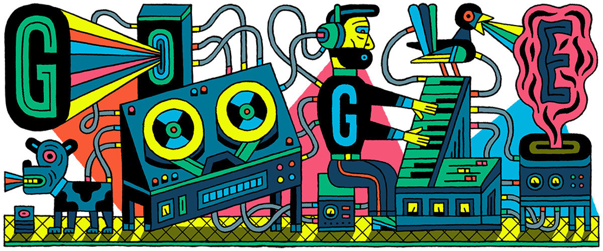

Google doodles use the recognisable typography of the Google logo modified by illustrators and designers to celebrate significant cultural and historical dates. To most internet users, the Google logotype is so familiar it is still recognisable even when modified far from it's original form. This gimmick has benefited Google by making them seem fun and more human than corporate.
The book 'A Smile In The Mind' by McAlhone, Stuart, Quinton and Asbury, argues that wit should be a balance of recognition and surprise. Wit is not the same as humour, it is a form of humour which requires existing knowledge to be understood.
The book explains the benefits of using wit in design. Wit gets the attention of people who are constantly being bombarded with messages. It allows the viewer to participate by decoding the message behind it. It lets the viewer feel rewarded for 'getting' it, and it amuses them, a feeling which people enjoy. By providing amusement, the designer has formed a bond with the viewer. The viewer is likely to feel less hostile toward whatever is being sold to them (because design is generally being used to sell things) when in an amused state of mind. Humour is also memorable to the viewer.
The smile in the mind technique is one approach to book cover design. It can indicate to the viewer the tone/ content of the book whilst also making the book stand out amongst others.

This is a cover design I have seen many times and really like it - it isn't clear from this image, but the design is a classic penguin cover with the title and author - '1984' 'George Orwell' - embossed yet covered by black boxes. An overarching theme of the novel is censorship, and so the information has been censored, however the embossing technique has been used so that a viewer can still identify which book this is.

This covers is incredibly simple but the more you look at it, the more you can unpack. When first read, it says FEASTING. When read again, you realise it says fasting as the E is crossed out. On closer inspection, you notice the cross is made from cutlery. At this point, it is clear what the book is about, and the eye travels down to the strap line which confirms it.
No comments:
Post a Comment