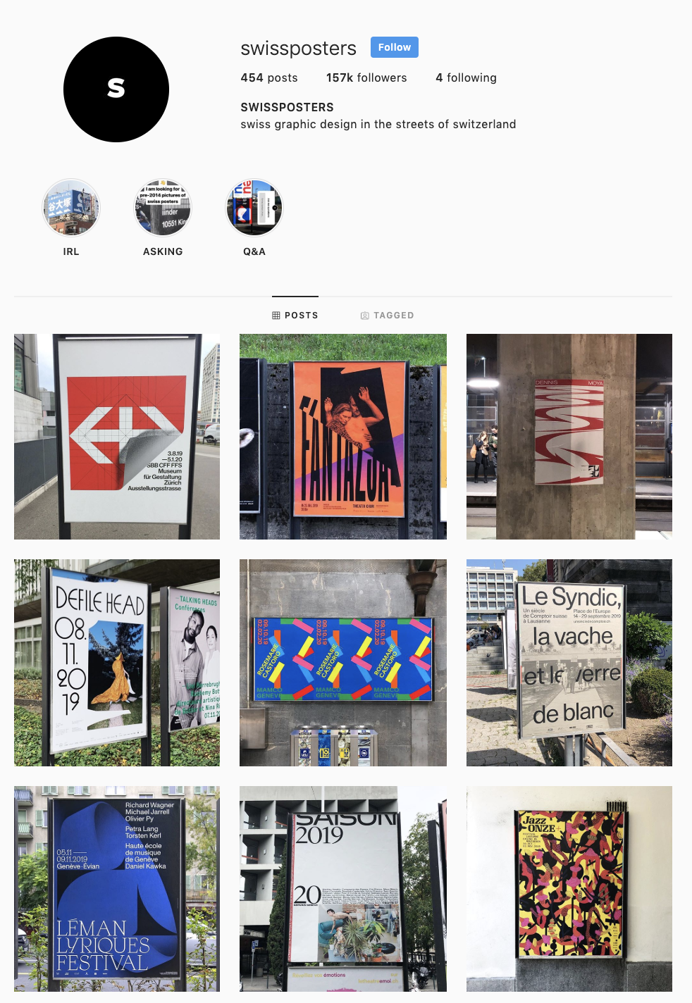
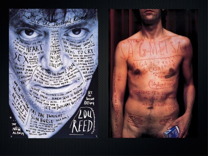
Designers and artists who have inspired my works (both consciously and subconsciously) Looking back through presentations, I think this image must have subconsciously inspired my idea to paper cut my letter forms. Saul Bass - 60's Graphic designer. I remember looking at his work when I was first introduced to graphic design about 8 years ago in school. One of my tutors suggested looking into him after seeing a rough prototype of my exhibition poster. @Swissposters (Instagram account) I feel like most young graphic designers have probably come across this page at some point. It features contemporary poster designs from all over the world and is a great place to see examples of experimental layout. Stefan Sagmeister - My high school art teacher was obsessed with this guy and I never really understood why until I watched the Helvetica documentary this year and gained a contextual understanding of his work. Whilst his visual language may look slightly dated today, it is his attitude to design which I admire. Whilst I respect the modernists such as Vignelli for what they have contributed to design, and agree that we can learn a lot from them, we need to keep experimenting and breaking rules in order to create things that are new and refreshing, just like Sagmeister did in the 90s. Otherwise, everything begins to look the same and it's difficult to decipher the meaning behind things if they are all being presented to you in the same tone of voice.
This module has certainly pushed me out of my comfort zone, which is exactly what I wanted from pursuing a degree in Graphic Design. Along with my increased understanding of typography, such as anatomical terminology and cultural context, I have learnt that successful design is not easily arrived at. When designing, in this case a typeface specifically, it is inevitable that problems will arise. Coming up with creative solutions to these problems is what makes a successful designer. A good designer does not simply sit down at their desk and produce a finished product on the first attempt. I have learnt that to create something I am truly satisfied with, I must keep on experimenting, reflecting, critiquing, and pushing my ideas. A successful design must be considered from many angles. The purpose of graphic design is to communicate in ways other than language; if your design does not communicate the message you intended it to, it cannot be considered successful. It is clear through personal experience and from pop culture that contemporary art has a negative reputation amongst some of the general public. It is seen as being for the few, not the many, which in turn leads those not involved to mock it. A while ago, a friend gave me a set of postcards by Grayson Perry called 'Playing to the Gallery'. In these cards, Perry critiques the contemporary art sector and highlights the hypocrisy and pretentiousness of modern artists. I think his points are perfectly valid and I first I was taking a similar approach to this. However, the difference between Perry and myself is that one of us is a fine artist and one of us is a graphic designer. Artists may critique modern society, however graphic designers have a duty do something to enact change where they see fit. My aim at first was to mock the exhibition for being haughty and inaccessible. However, through research and development I realised that this was a counter productive approach and that it would be much more worth my time making the exhibition accessible to all. After all, the exhibition had a problem, and I as a graphic designer am a problem solver. Thus my typeface Zugriff Sans was born. I would be lying if I said I was completely satisfied with it, but then again, I don't think creatives often are satisfied as we must always look at our work with a critical eye. Critiques I have of my typeface are that I certainly could have pushed it much further into unexplored territory, and it could definitely look more modern than it does. However, my intention to make contemporary art feel welcoming to all through the medium of graphic design is, in my opinion, a success. The visual language of so many galleries and exhibitions is cold and unfriendly. It says 'this isn't for you, sweetheart'. The work I have created for BNC invites everyone and anyone to be a part of the exhibition through it's playful friendly design. It still maintains a level of sarcasm with the stylistic 'O' alternative, which speaks to those who are already fans of contemporary art without being intimidating. It is unclear who is the butt of the joke here, which makes the point: why should anyone have to be the butt of the joke? Art should be for all, no matter what their education, age or background.
Presented in an unpretentious booklet on humble recycled paper and hand bound, the type specimen makes it clear that money is not important when it comes to having good taste. The contemporary layout of the specimen enforces though that, though this might not be high end, it is certainly an informed piece of work and should not be questioned.
Below is the rationale for my typeface. The purpose of this is to explain the ideas behind the typeface and sell it to a potential client. I read some other type rationales from successful typographers such as colophon foundry to get a better understanding of the tone of voice this should be written in. The name of my typeface, Zugriff Sans, comes from the German word for 'access'. My typeface is designed to make fine art more accessible to the general public. I translated it into German as a nod to the many influential German type designers. "Zugriff Sans is a custom typeface commissioned for the Bloomberg New Contemporaries 2020 exhibition. The typeface aims to address issues surrounding the approachability of the contemporary art world for the general public. Zugriff Sans aims to address the intimidating nature of contemporary art for those who are unfamiliar through grounding it's visual language within the familia: simple, hand-made forms similar in tone to paper cutting and stencilling. Zugriff Sans has been designed with the intention of welcoming viewers in to the rich, diverse world of contemporary British art. It is bold yet playful, classic yet contemporary. Hand-cut letter forms root the typeface within tradition, yet the unconventional structure of the characters provides the typeface with a contemporary edge. A low x-height forces the horizontal strokes to expand and the apertures to close, providing a sense of gravity to the characters and increased visual assurance. The excessive weight of the characters above the x-height increases their connection to the baseline and their sense of groundedness. The interchangeable O and 0 add a unique interactive element with endless design possibilities that can be explored when it is applied to the exhibition's collateral."
This is the draft of my type specimen I showed: feedback: some really good ideas in the feedback, I will be trying lots of these out. Will experiment more with the layout so it compliments the poster, I like the eye stencil idea, printing images in colour and maybe with more structure too. It seems that my intentions behind the typeface have translated well. I have received a lot of compliments on how professional my work looks, which is reassuring. Planning on printing finished specimen on a thick, rough, off white paper thats cheap as I think it will compliment how humble my typeface is.
today:
experimenting with the logotype
making posters
what i did:
what i learnt:
my typeface looks too clean and safe and boring