Sketches of typography ideas:


Also, I originally was planning for the drinks to be packaged in cans, however I am now considering glass bottles because they are more sophisticated and provide a nicer drinking experience - they are also a collectible item - lots of people keep nice glass bottles to display or use as vases/ candle holders etc. If people want to collect the bottles, this strengthens the idea that this is a cult brand and can incorporate things like limited edition flavours/ bottle designs.
Existing soft drinks which come in glass bottles:

Fentimans - high end, expensive, sold in independant cafes/ bars, aimed at adults not children, focus is placed on the high quality ingredients used. Packaging is reminiscent of victorian tonic drinks.
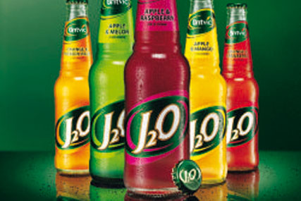
J2O - mostly bought for children in pubs

Jarritos - originating in Mexico, rare find in the UK gives it a kind of cult following
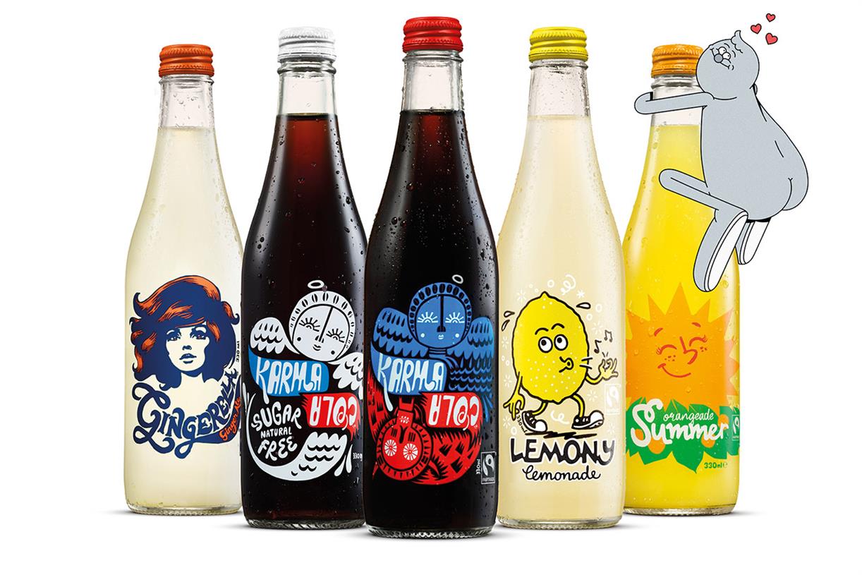
Karma cola -
No comments:
Post a Comment