Thursday 12 December 2019

Paste Up

Pasted up poster today


pleased with it, think it's impactful
this one is the index

added texture etc due to process

Tuesday 10 December 2019

Sketchbook

Compared to my previous sketchbook, I have put more thought into the lay out of this one. I have also utilised the space on the pages more sensibly - previously, I was printing a lot of my digital work very small which wasn't doing it justice. I also learnt to print things out as soon as I do them - otherwise it's easy to forget things.

Final Posters

I have now completed all three of my posters.

Monday 9 December 2019

Image Processing


Even after digitally manipulating the original vector image in photoshop with the liquify tool, it still wasn't quite 'punk' enough. I decided to physically manipulate it as well. I pasted layers of the image on top of each other and then ripped sections out, using a safety pin as an aid. This was inspired by posters being ripped off of billboards by music fans. the result is messy - there are torn edges everywhere and glue residue. This is fitting as the poster is inspired by a Sex Pistols song, who were known for being destructive and messy.

Contemporary Posters

Bráulio Amado - Bad Studio
     

The chaos of the first poster is balanced with the frame and the typography.
Amado uses a grid in the second poster but still breaks many 'rules' of design - the stretched smiley face, the overlaying of the word 'acid' on the other text. The black flecks give a photocopied- effect. Some may think this is laziness, but it is clear that they were left there intentionally by the designer.

'Imperfections' in the designs indicate independence from corporate bosses - this is design by people who are passionate about it, often for those who have an interest in the arts.


Félicité Landrivon
  

heavily influenced by DIY aesthetics
passion about the musicians represented in the posters is made clear through extensive research - the posters are personal to each gig, none of them following the same format
multi disciplinary - collage, type, illustration
designer uses bitmapping and photocopying to make type and illustrations look lo-fi
grids are employed but overlap is allowed where it benefits the design

Idea Development - Icon

My initial images were a step in the right direction, however they looked bland and a little obvious as they were. I decided to take the same concept, of having the safety pin through my nose, but to create the images differently. Instead of using a traditional camera, I took the images using a flat bed scanner and smushing my face against it. In some of the scans I remained still and in others I moved as it was being taken to produce different results. 

The makeup I chose to do for these shots was messy and quick. Punk makeup was about rebelling against societal beauty norms and I have emulated this by smudging black on my eyes and lips. I used bold strokes of black eyeliner and didn't blend anything to add texture.  The eyebrow shape was inspired by Siouxsie Sioux.

The resulting images have a sense of discomfort and claustrophobia. They look as if they could be close up shots of someone being pushed around in a mosh pit - this links to my research about punk culture. 


These images give me more to work with than my original photographs as they have more organic texture and distortion. I am going to experiment with inverting the images and overlaying them.

Idea Development - Symbol

In my research I came across artwork used to promote God Save The Queen released by the Sex Pistols in 1977. It featured an image of Elizabeth II with a safety pin on her face. 


I had already looked at punk iconography for my first poster, but now needed a way to abstract the idea I was communicating. I looked at the sheet music for the song and created a design based on the opening chords by following the staves and notes. 


Similar to my typography vectors, this has the issue of looking very flat and too clean. It doesn't express the punk ideology which inspired it. I will continue to experiment with the image by processing it in different ways - digitally manipulating, photocopying, collaging etc

Tuesday 3 December 2019

Idea Development - Index

I decided to draw a vector illustration of a safety pin, and whilst doing so I noticed that one end of it looked like a letter 'u', and then flipped upside down like an 'n'. This gave me the idea to create some typography from the form of the object itself.


Initial sketch

I had already been experimenting with typography and had been using 'unity' as my word - in my research I had found that post Trump's election, some people had begun wearing safety pins to show solidarity with those persecuted by his government. This also refers to the original use of safety pins, to hold together fabric - to unite it.

Using Illustrator, I created a vector version of my initial sketch. I experimented with different weights, with adding texture in the background and with using the stems of the pin. In was happy with the form of the typography I produced, but over all it looked too clean and flat to be a finished poster.


I had previously been experimenting with metallic typography and decided to apply this same effect to the vector, however my previous metallic type looked very 'fake' and digitalised. I took a high resolution scan of a safety pin and manipulated it in photoshop using the liquify tool to retain the original texture and finish of the metal.


I was pleased with this result because it looks unique and the reduced legibility draws the viewer in by forcing them to look closer.

Thursday 28 November 2019

Image Processing

Following the crit from the other day, I have been processing images in the same way I did my original safety pin photos by ripping them, crumpling them and then stitching them back together with pins.


These photocopies are so low resolution however that i think it takes away from the impact of the images. I am going to scan them instead of photocopying to get a higher quality image.

I am also starting to work on some typography. I want to focus on another association of safety pins, which is unity in the face of oppressive political powers. Using the word unity, I want to imitate lettering from punk posters/ band logos. This will then either be a poster in its self or an element of one of the posters.

Icons, Indexes and Symbols

-An Icon has a physical resemblance to the signified, the thing being represented. A photograph is a good example as it certainly resembles whatever it depicts.

-An Index shows evidence of what’s being represented. A good example is using an image of smoke to indicate fire.


-A Symbol has no resemblance between the signifier and the signified. The connection between them must be culturally learned. Numbers and alphabets are good examples. There’s nothing inherent in the number 9 to indicate what it represents. It must be culturally learned.


E.g.


Found this article useful : https://vanseodesign.com/web-design/icon-index-symbol/


It is important to note that overlap between the categories is inevitable and the theory's basis is more sociological than scientific.

Tuesday 26 November 2019

Semiotics

Semiotics is an investigation into how meaning is created and how meaning is communicated. Its origins lie in the academic study of how signs and symbols (visual and linguistic) create meaning.

It is a way of seeing the world, and of understanding how the landscape and culture in which we live has a massive impact on all of us unconsciously.
Philosopher Charles Sanders Peirce wrote a theory of semiotics in the 1860s which is still widely used today. Pierces' theory of semiotics is based on logic. He defined a sign as “something which stands to somebody for something,”. Peirce believed signs could be categorised into three groups:
1) Icon - This physically resembles it's referent.
2) Index - This depicts something which is associated with it's referent.
3) Symbol - This must be culturally learnt to understand what it's referring to.
Peirce also noted that a sign can never have a unanimous meaning - there is always room for differing interpretations. We need to understand the context in which a sign is communicated in order to understand it's intended meaning.

Oripeau

Oripeau is a project which sees posters pasted on a board in a town in France. Anyone can submit a poster design. The project 'is an invitation to put graphic diversity back on the street.' - (could this be backlash against postmodernism inundating public design with helvetica?)

The project eliminates hierarchy and elitism in the world of professional graphic design. It also allows designers to step away from designing for consumption or to push ideologies - the two main reasons designer's are employed. I see this brief as an opportunity to design purely for the joy of it.

Looking at previous Oripeau posters, many of them seem abstract. However, they differ from abstract art in that they employ the visual language of design by using typography, grids and layout alongside different image making techniques.


Similar projects:
Ficciones Typografika
Typografika Politika
Toof Prints
Projekt ROOOOOM
NoPARKING


By Ivan Hydar
Uses suggestions of recognisable shapes in amongst the chaos - pure chaos isn't engaging to look at but these images draw the eye in as it tries to make sense of whats happening. The impact of these is perhaps lost slightly though in this context.


By Jean-Francois Flamey
simple image - more impactful. Image processing has left the image feeling unsettling and haunting, the horse looks ominous, yet it is still recognisable.


By Sasha Kulikov

From article on culturetrip: 
"What is a Spätkauf?

Readers will already be familiar with Spätikaufs, even if they don’t know it — it’s a convenience store, home of extremely out-of-date penny sweets that no longer cost a penny, the favorite Sunday pickup point for locals to collect their newspapers."


These are German convenience stores which are open 24 hours, or if not then very late. Apparently, it is common for Berliners to congregate outside these stores to drink beer and chat, and this is seen as a positive thing.

The symbols in the corners and barcode indicate this piece is about consumerism. The typography is very impactful - it has elements of retro but still feels contemporary. The shapes of the letters feel very friendly and playful. It is nostalgic. I imagine the creator feels fondly towards these Spätikaufs and upholds them as a positive aspect of Berlin culture.

From analysing these posters, I have learnt that: 
-Texture will be added due to the pasting up process, so bare that in mind. 
-When viewed from a distance, small details will be lost.
-Bold is better.
-Whilst a few of the posters do incorporate colour, the most impactful ones are black and white. Removing colour from the design process allows the designer to focus more on shape, balance and texture. For this reason, I decided to keep all of my designs black and white.

Poster Ideas


Initial Ideas:
punk style nose piercings, pins in face/ skin
fabric of band t-shirts being held together/ torn apart
pins on protest patches


Post Crit:
develop ideas from some of other research, as well as punk culture. 
pins as protest - trump voodoo doll?
punk style typography, metallic finish like the pins - word like 'unity' to refer to protests?
scrunch up and pin together the face scans
print onto fabric patches, cut up and pin together.

looking at other posters, think my images would be more impactful utilising negative space and experimenting with layout

Friday 22 November 2019

6 Degrees of Separation

Theory: Every person in the world is separated from every other person by 6 instances.

Ref: Kevin Bacon theory


Task: Link 6 designers/ studios to each other and come full circle


Andy Warhol
Although more widely known as an artist, Warhol designed many record sleeves. He started early on in his career, often working under the graphic designer Reid Miles. His record designs showcase the development of his own icon style.


Stefan Sagmeister
Famed for breaking the rules, Sagmeister's approach to design has come to represent the post-modernist movement. In a backlash against minimalism and clean lines, he employed unorthodox methods to re-define what graphic design is.


Egon Schiele
Schiele was an expressionist painter, a protoge of Klimt. His paintings are intense and graphic. Schiele designed several exhibition posters which incorporated lettering. His approach to lettering, similar to his painting style, was an important contribution to the Vienna Succession movement.


Alphonse Mucha
Called 'the original graphic artist', Mucha's illustrative figures were applied to many advertisements and have become an icon of the Art Nouveau movement. Mucha also did lettering for many of these adverts.


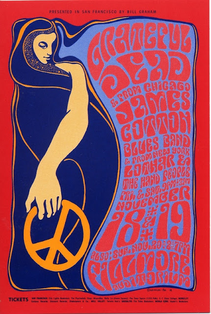
Wes Wilson
Wilson designed posters for gigs in 9160's San Francisco. His style has become synonymous with the psychedelic rock movement of the time. Wilson borrowed heavily from Mucha's style, using imagery of women with flowing hair and curly lettering, all in bright contrasting colours.


Keith Haring
Haring began by drawing in the subways of New York in the 80s. His bold line style is instantly recognisable, as are his common motifs of people, dogs and babies. Haring designed iconic posters for exhibitions and events, as well as protest posters fighting the AIDs crisis.


Each of these artists inspires me because their integrity shows in their work. Despite backlash against their unique styles, they all ignored criticism and pursued what that cared about. I think it is important to be passionate about what you are creating and not just do it for approval or praise.


These are the posters I made inspired by the artists - didn't have time to do one for each

Safety Pins - Research


History
Safety pins are an ancient invention which have stayed pretty much the same for millennia. Originally used to hold clothing such as togas in place. Wealthy people used elaborate pins made of silver or gold, poorer people used cheaper metals. By the fifteenth century, pins were made from iron. Kilts (Scottish) are still usually worn with large pins to hold them in place.

"In 1849, Hunt was struggling financially. Reportedly, he sat in his workshop, worrying about how to pay off a $15 debt he owed to a friend, while playing with a length of wire. As he was twisting it, he discovered that when coiled and then clasped to itself, the wire retained enough spring to be unclasped and clasped again. He completed a prototype and several design sketches in one evening, patented the device on April 10th, 1849, and subsequently sold the patent for $400 to W.R. Grace and Company to pay off the debt to his friend."

Like most consumables, the price of safety pins reduced massively due to the industrial revolution. Most safety pins today are made from stainless steel. Over 3 million safety pins can now be made by one factory in a single day.


Punk
Safety pins were and still are associated with punk fashion. They're a cheap and easy way to customise your clothes and even your face. Lots of people use them to pin patches, often featuring band logos, onto jackets and jeans. Due to the lifestyle of most punks, clothes became damaged quickly and pins were an easy way to fix them. Johnny Rotten of the Sex Pistols, said that safety pins were originally incorporated (into the punk aesthetic) for practical reasons, for example, to remedy “the arse of your pants falling out”.

Safety pins are associated with home piercings - something which seems to have remained popular in youth culture for decades, almost like a rite of passage, despite it being risky. I remember my mum telling me how her friends at uni put frozen chips up their nostrils then shoved safety pins through to pierce them.

I've also seen people use them to do stick and poke tattoos - this is another link to DIY rebellious youth culture.

I think most people today look back at punk culture as something which has always been regarded as cool but most old school punks were completely rejected from society at the time for their lifestyle, appearance and ideology.

"The result was bittersweet: The alienation (and bullying) my new look inspired was genuinely painful; the handful of people who recognised me as one of them, however, became the best of friends – to this day." - quote from 70's punk.


Protest
After Trumps election in 2016, a group of people started a social media campaign saying they were going to wear safety pins on their lapels to show that they opposed him and to signal to 'minorities' that they were safe from prejudice around them.

"Some Americans are wearing safety pins amid fears of abuse against minorities, immigrants, women and members of the L.G.B.T. community" New York Times.


Fact
The longest chain of safety pins measures 1,733.1 m (5,686 ft 0.2 in), achieved by Sri Harsha Nune and Sri Navya Nune (both India) in Gujarat, India, on 23 April 2018.


Superstition
In some places in India it is common for  safety pins and sewing needles to be kept for generations and passed from mother to daughter. 

In the Ukraine it is still a practice today to pin safety pins to the inside of a child’s clothing, to ward off evil spirits. 

In many European countries, finding a safety pin is considered good luck.

Fashion
Whilst safety pins began their existence as practical tools to hold clothing in place, they have now become associated with contemporary fashion. As well as being used to reference to punk culture, many designers offer luxury jewellery and fashion featuring solid gold safety pins for example, which contrasts with their original use.


Moschino Denim


James Charles wearing safety pin top at Met Gala 2019.


Liz Hurley in Versace

Safety pins are interesting because they are easy to connect and build from. If you have some fabric and some safety pins, you can effectively make an outfit. They are cheap to produce, which makes them accessible to a lot of people. They can be used to temporarily mend clothing.

I have a safety pin hooked on one of my earrings. I've been wearing it for about 6 months. It comes in useful quite often. I cleaned my nails with it at a music festival, for example. I've also used it on a night out to temporarily fix a necklace which broke. I don't even know how much it cost as it's one of those things most people have laying around, but it certainly will have been cheap.