Thursday 28 November 2019

Image Processing

Following the crit from the other day, I have been processing images in the same way I did my original safety pin photos by ripping them, crumpling them and then stitching them back together with pins.


These photocopies are so low resolution however that i think it takes away from the impact of the images. I am going to scan them instead of photocopying to get a higher quality image.

I am also starting to work on some typography. I want to focus on another association of safety pins, which is unity in the face of oppressive political powers. Using the word unity, I want to imitate lettering from punk posters/ band logos. This will then either be a poster in its self or an element of one of the posters.

Icons, Indexes and Symbols

-An Icon has a physical resemblance to the signified, the thing being represented. A photograph is a good example as it certainly resembles whatever it depicts.

-An Index shows evidence of what’s being represented. A good example is using an image of smoke to indicate fire.


-A Symbol has no resemblance between the signifier and the signified. The connection between them must be culturally learned. Numbers and alphabets are good examples. There’s nothing inherent in the number 9 to indicate what it represents. It must be culturally learned.


E.g.


Found this article useful : https://vanseodesign.com/web-design/icon-index-symbol/


It is important to note that overlap between the categories is inevitable and the theory's basis is more sociological than scientific.

Tuesday 26 November 2019

Semiotics

Semiotics is an investigation into how meaning is created and how meaning is communicated. Its origins lie in the academic study of how signs and symbols (visual and linguistic) create meaning.

It is a way of seeing the world, and of understanding how the landscape and culture in which we live has a massive impact on all of us unconsciously.
Philosopher Charles Sanders Peirce wrote a theory of semiotics in the 1860s which is still widely used today. Pierces' theory of semiotics is based on logic. He defined a sign as “something which stands to somebody for something,”. Peirce believed signs could be categorised into three groups:
1) Icon - This physically resembles it's referent.
2) Index - This depicts something which is associated with it's referent.
3) Symbol - This must be culturally learnt to understand what it's referring to.
Peirce also noted that a sign can never have a unanimous meaning - there is always room for differing interpretations. We need to understand the context in which a sign is communicated in order to understand it's intended meaning.

Oripeau

Oripeau is a project which sees posters pasted on a board in a town in France. Anyone can submit a poster design. The project 'is an invitation to put graphic diversity back on the street.' - (could this be backlash against postmodernism inundating public design with helvetica?)

The project eliminates hierarchy and elitism in the world of professional graphic design. It also allows designers to step away from designing for consumption or to push ideologies - the two main reasons designer's are employed. I see this brief as an opportunity to design purely for the joy of it.

Looking at previous Oripeau posters, many of them seem abstract. However, they differ from abstract art in that they employ the visual language of design by using typography, grids and layout alongside different image making techniques.


Similar projects:
Ficciones Typografika
Typografika Politika
Toof Prints
Projekt ROOOOOM
NoPARKING


By Ivan Hydar
Uses suggestions of recognisable shapes in amongst the chaos - pure chaos isn't engaging to look at but these images draw the eye in as it tries to make sense of whats happening. The impact of these is perhaps lost slightly though in this context.


By Jean-Francois Flamey
simple image - more impactful. Image processing has left the image feeling unsettling and haunting, the horse looks ominous, yet it is still recognisable.


By Sasha Kulikov

From article on culturetrip: 
"What is a Spätkauf?

Readers will already be familiar with Spätikaufs, even if they don’t know it — it’s a convenience store, home of extremely out-of-date penny sweets that no longer cost a penny, the favorite Sunday pickup point for locals to collect their newspapers."


These are German convenience stores which are open 24 hours, or if not then very late. Apparently, it is common for Berliners to congregate outside these stores to drink beer and chat, and this is seen as a positive thing.

The symbols in the corners and barcode indicate this piece is about consumerism. The typography is very impactful - it has elements of retro but still feels contemporary. The shapes of the letters feel very friendly and playful. It is nostalgic. I imagine the creator feels fondly towards these Spätikaufs and upholds them as a positive aspect of Berlin culture.

From analysing these posters, I have learnt that: 
-Texture will be added due to the pasting up process, so bare that in mind. 
-When viewed from a distance, small details will be lost.
-Bold is better.
-Whilst a few of the posters do incorporate colour, the most impactful ones are black and white. Removing colour from the design process allows the designer to focus more on shape, balance and texture. For this reason, I decided to keep all of my designs black and white.

Poster Ideas


Initial Ideas:
punk style nose piercings, pins in face/ skin
fabric of band t-shirts being held together/ torn apart
pins on protest patches


Post Crit:
develop ideas from some of other research, as well as punk culture. 
pins as protest - trump voodoo doll?
punk style typography, metallic finish like the pins - word like 'unity' to refer to protests?
scrunch up and pin together the face scans
print onto fabric patches, cut up and pin together.

looking at other posters, think my images would be more impactful utilising negative space and experimenting with layout

Friday 22 November 2019

6 Degrees of Separation

Theory: Every person in the world is separated from every other person by 6 instances.

Ref: Kevin Bacon theory


Task: Link 6 designers/ studios to each other and come full circle


Andy Warhol
Although more widely known as an artist, Warhol designed many record sleeves. He started early on in his career, often working under the graphic designer Reid Miles. His record designs showcase the development of his own icon style.


Stefan Sagmeister
Famed for breaking the rules, Sagmeister's approach to design has come to represent the post-modernist movement. In a backlash against minimalism and clean lines, he employed unorthodox methods to re-define what graphic design is.


Egon Schiele
Schiele was an expressionist painter, a protoge of Klimt. His paintings are intense and graphic. Schiele designed several exhibition posters which incorporated lettering. His approach to lettering, similar to his painting style, was an important contribution to the Vienna Succession movement.


Alphonse Mucha
Called 'the original graphic artist', Mucha's illustrative figures were applied to many advertisements and have become an icon of the Art Nouveau movement. Mucha also did lettering for many of these adverts.


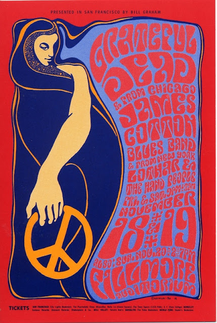
Wes Wilson
Wilson designed posters for gigs in 9160's San Francisco. His style has become synonymous with the psychedelic rock movement of the time. Wilson borrowed heavily from Mucha's style, using imagery of women with flowing hair and curly lettering, all in bright contrasting colours.


Keith Haring
Haring began by drawing in the subways of New York in the 80s. His bold line style is instantly recognisable, as are his common motifs of people, dogs and babies. Haring designed iconic posters for exhibitions and events, as well as protest posters fighting the AIDs crisis.


Each of these artists inspires me because their integrity shows in their work. Despite backlash against their unique styles, they all ignored criticism and pursued what that cared about. I think it is important to be passionate about what you are creating and not just do it for approval or praise.


These are the posters I made inspired by the artists - didn't have time to do one for each

Safety Pins - Research


History
Safety pins are an ancient invention which have stayed pretty much the same for millennia. Originally used to hold clothing such as togas in place. Wealthy people used elaborate pins made of silver or gold, poorer people used cheaper metals. By the fifteenth century, pins were made from iron. Kilts (Scottish) are still usually worn with large pins to hold them in place.

"In 1849, Hunt was struggling financially. Reportedly, he sat in his workshop, worrying about how to pay off a $15 debt he owed to a friend, while playing with a length of wire. As he was twisting it, he discovered that when coiled and then clasped to itself, the wire retained enough spring to be unclasped and clasped again. He completed a prototype and several design sketches in one evening, patented the device on April 10th, 1849, and subsequently sold the patent for $400 to W.R. Grace and Company to pay off the debt to his friend."

Like most consumables, the price of safety pins reduced massively due to the industrial revolution. Most safety pins today are made from stainless steel. Over 3 million safety pins can now be made by one factory in a single day.


Punk
Safety pins were and still are associated with punk fashion. They're a cheap and easy way to customise your clothes and even your face. Lots of people use them to pin patches, often featuring band logos, onto jackets and jeans. Due to the lifestyle of most punks, clothes became damaged quickly and pins were an easy way to fix them. Johnny Rotten of the Sex Pistols, said that safety pins were originally incorporated (into the punk aesthetic) for practical reasons, for example, to remedy “the arse of your pants falling out”.

Safety pins are associated with home piercings - something which seems to have remained popular in youth culture for decades, almost like a rite of passage, despite it being risky. I remember my mum telling me how her friends at uni put frozen chips up their nostrils then shoved safety pins through to pierce them.

I've also seen people use them to do stick and poke tattoos - this is another link to DIY rebellious youth culture.

I think most people today look back at punk culture as something which has always been regarded as cool but most old school punks were completely rejected from society at the time for their lifestyle, appearance and ideology.

"The result was bittersweet: The alienation (and bullying) my new look inspired was genuinely painful; the handful of people who recognised me as one of them, however, became the best of friends – to this day." - quote from 70's punk.


Protest
After Trumps election in 2016, a group of people started a social media campaign saying they were going to wear safety pins on their lapels to show that they opposed him and to signal to 'minorities' that they were safe from prejudice around them.

"Some Americans are wearing safety pins amid fears of abuse against minorities, immigrants, women and members of the L.G.B.T. community" New York Times.


Fact
The longest chain of safety pins measures 1,733.1 m (5,686 ft 0.2 in), achieved by Sri Harsha Nune and Sri Navya Nune (both India) in Gujarat, India, on 23 April 2018.


Superstition
In some places in India it is common for  safety pins and sewing needles to be kept for generations and passed from mother to daughter. 

In the Ukraine it is still a practice today to pin safety pins to the inside of a child’s clothing, to ward off evil spirits. 

In many European countries, finding a safety pin is considered good luck.

Fashion
Whilst safety pins began their existence as practical tools to hold clothing in place, they have now become associated with contemporary fashion. As well as being used to reference to punk culture, many designers offer luxury jewellery and fashion featuring solid gold safety pins for example, which contrasts with their original use.


Moschino Denim


James Charles wearing safety pin top at Met Gala 2019.


Liz Hurley in Versace

Safety pins are interesting because they are easy to connect and build from. If you have some fabric and some safety pins, you can effectively make an outfit. They are cheap to produce, which makes them accessible to a lot of people. They can be used to temporarily mend clothing.

I have a safety pin hooked on one of my earrings. I've been wearing it for about 6 months. It comes in useful quite often. I cleaned my nails with it at a music festival, for example. I've also used it on a night out to temporarily fix a necklace which broke. I don't even know how much it cost as it's one of those things most people have laying around, but it certainly will have been cheap.

Thursday 21 November 2019

7 Contrasts

I have been reading up some more on Johannes Itten's colour contrast theory and making collages from a few magazines I have. Itten's work is important as he was one of the first people to categorise colour the way we do today, using hue, tone etc...

Wednesday 20 November 2019

Colour theory - GIF

Research - aspects of colour theory.
A while ago, I remembered watching a video about how purple isn't a real colour (https://www.youtube.com/watch?v=NVhA18_dmg0). 

I looked into this further and basically, to sum it up: "Scientifically, purple is not a color because there is no beam of pure light that looks purple. There is no light wavelength that corresponds to purple. We see purple because the human eye can't tell what's really going on."

My initial idea for a GIF was to collage famous images from pop culture featuring purple but the have the purple parts missing. Ideas for this were Prince's Purple Rain album, Gene Wilder in the original charlie and the chocolate factory and cadbury's chocolate. However, this felt a little juvenile and obvious.

My research on purple being a 'fake' colour lead to reading about ultra-violet. Ultra-violet was the Pantone colour of the year in 2018.


Then I remembered an article I had seen a while ago about how ultra-violet photography has allowed us to visualise how bees see flowers. (https://forfun.com/4Cn9)


I decided to create my gif using images containing flowers and editing them to look like they were taken under UV light. This isn't the right time of year for flowers to bloom, so I looked through my own catalogue of photos and found a few featuring flowers. I edited these in photoshop by inverting them and adding colourful layers. The close up flowers are from this article. I wanted to keep the analogue feel of the photos so I added in layers of film strip and overlaps with other photos.

I experimented with different frame lengths but having them any more than 0.2s made the gif look jerky and unprofessional. The gif moves very fast but I think that makes it more intriguing to a viewer and further communicates the idea of seeing through a bee's eyes as insects move quite erratically. 

Monday 18 November 2019

New Module

Portfolio of outcomes 
8 A3 design boards
Blog


Buy sketchbook
Do reading (list on estudio)
Ficciones Typographica - look at this


Brief: Object
Looking at:
Layout
Composition
Colour
Image process


Improve
Rationale - goes on design board. SPaG. explain ideas. Use technical vocab
Refer to other designers. Link to CoP
Research - analyse it. More independent research
Initial ideas - engage fully in study tasks
Design development - use broad range of process. Iterate
Be organised - blog every day. Sketchbook daily. Improve presentation of sketchbook


Oripeau project
3 ideas for posters
Research given object
Forms of representation:
Icon
Index
Symbol


Poster 175 x 91 cm
In public space
White paper unless specified


Task: colour theory
20 frame gif that visually represents an aspect of colour
Johannes Ittens Josef Albers 
1080 x 1080 px 300dpi
Instagram it and storyboard


Colour theory
Documentary
Colours influence how we live our lives
Do we see colour the same as each other
Colour names in language vid - vox?
Colour is an illusion
150 ppl doing an experiment
Red - love danger violence
Russel hill - does wearing red help us with competitiveness
Tai kwon do - red vs blue. Red wins significantly more often. 2/3rds
Referees favour ppl in red
Top football teams often have red kit
Experiment - penalty shoot out, some in red, some in blue, some in white
Does red make ppl feel more powerful or does it intimidate the goal keeper
Measured hormones
Ppl do worse on IQ tests if they see red before
3 colour lit pods - red white blue. Change perception of time. Blue speeds up time
Reds n browns make u hungry thats why restaurants often use them. Warm lighting
Blue light made diners go giddy at 10pm in a restaurant
Photosensitive ganglia - eye cell regulates body clock. Sensitive only to BLUE. (blue light from laptops phones keeps me awake)
Early life single cell organisms in the ocean sensitive to blue & yellow moved around the ocean
Colour is a construct of our brains it doesn’t exist
Colour constancy 
Language affects how we see colour
Himba people have only a few words to describe colour
See colour differently
Synesthesia


“Johannes Itten, painter, designer and teacher in the Bauhaus school, he´s the first to make a theory about the possible types of contrasts that are produced by the different features of color. Johannes distinguished seven types of contrast. saturation, temperature, simultaneous, proportion, luminosity, hue and complementary colors.”


“THE 7 COLOR CONTRASTS IDENTIFIED BY JOHANNES ARE:


1- THE CONTRAST OF PURE COLORS. CONTRAST OF SATURATION.
100% of color saturation produces a high visual contrast. These colors do not contain any other colors, neither black nor white.


2- COLOR CONTRAST BETWEEN WARM AND COLD COLORS. TEMPERATURE CONTRAST.
The difference of temperature that the color has, increases the visual contrast between the two colors.


3- SIMULTANEOUS CONTRAST.
When we have a saturated color (without any gray or white) and we place it above a gray, inside the gray tone we will see the complementary color of the saturated color. If we have a red on a gray, some blue hue will be generated inside the gray color (blue is the complementary of the red). Simultaneous means that the contrast is generated because a color is near another color, and there is always an visual effect between them.


4- THE CONTRAST OF PROPORTION.
We have two colors but each color occupies a different area, or size. This difference generates a quantity contrast.


5- THE CONTRAST OF LIGHT AND DARK.
Juxtaposition of two colors with different brightness or tonal value.


6- CONTRAST OF COMPLEMENTARY COLORS.
It is the contrast that create two opposite colors on the color wheel, that is the complementary colors.


7- CONTRAST OF QUALITY OR HUE
The quality or hue of the color, if it is more or less saturated, this will make the color more live or turned off. When we are placing a bright color near one without hue, a visual contrast is generated.”


Interaction of colour - josef albers
Johannes itten - the art of colour
Hue = one specific colour
Colour = a set of hues
Shades = hue plus black
Hint = hue plus white
Tone = hue plus black
7 contrasts

Initial idea: colours used to cancel each other out in makeup eg green over red patches, orange over purple bruises 

Friday 8 November 2019

Module Evaluation

strategies & ideas used in typography i will use in future: creating grids from research, modular type, chopping and distorting existing typefaces.
considerations when designing type:
legibility, tone of voice, cultural context

have i taken enough risks? no probably not, although I certainly feel like I have pushed my boundaries in this module, I'm aware this is only the start of my degree and I'm looking forward to pushing even more boundaries.
The stage of the design process i find most difficult is articulating my ideas to other people & giving myself constructive feedback. I'm good at criticising my work but often it ends there, which just has a negative impact. I need to work more on having a positive mindset towards perceived failures.

I wouldn't say I have achieved my full potential yet, but I would say am on the first step of the ladder. Re-entering education is a strange experience and I am adjusting my ways of working to fit in with whats expected of me. I feel that coming to university as a 'mature' student was certainly the right choice for me as I have had a few years to experience the 'real' world and mull over what I want from the future, and I am very determined to be a successful designer. 

However, I am aware that I put myself under immense pressure to succeed and so on reflection, it would be ridiculous to expect myself to have reached my full potential in only the first module. If that was achievable, then degrees wouldn't be 3 years long.

I know I have a lot more to learn, both about design and about myself.
In future modules I want to step even more out of my comfort zone, know that it's ok to fail and make mistakes and that sometimes mistakes can be positive things.

I have made good use of the university facilities during this module. I love libraries and we have a particularly great one here and, whilst a lot of reading was not necessary for this module, it is a brilliant space to work and look for inspiration.

Learning bookbinding was very interesting and has come in use as I thought it would be most appropriate to have my type specimen hand bound, to fit in with its humble appearance.

I didn't use any of the digital print facilities as I was able to do everything I needed on the laser printer in our studio, however I am looking forward to using that facility in the future.

Working amongst other young creative people has been not only beneficial to my work but also highly enjoyable. I have asked countless peers for their advice/opinions and also have been able to offer help to others. Our year group seems to have become a community already which I think enriches the course even further. It's refreshing to see others as passionate about design as I am.

Partaking in crits with peers is very useful as it allows my work to be seen through fresh eyes. Everyone has different backgrounds and interests and so sees things in different cultural contexts. For example, I had a test print of one of my posters laying on my desk and another student said it looked like Deadpool's face (a marvel character). I hadn't noticed this before as Deadpool isn't often on my mind, but when I looked I agreed that he was totally correct. As a result I changed the colours of that particular graphic to ensure no confusion in the future. 

The workload was manageable as long as I planned ahead and was strict with myself. Ben's advice about scheduling time to relax was particularly important. Having studied graphic design previously in an apprenticeship, I only had about 4 contact hours a week and was used to been given a brief and then working on it completely in my own time, and then just showing an end product. This university course is very different to that, and at first I did struggle a bit with having my hand held so much at each step, but obviously the reason this is done is because we are here to learn.

In the future I am going to make much better use of my blog. Due to the trauma of secondary school English, I have doubted my writing skills for many years now so the prospect of writing a blog which other people would read was very daunting to me. I now understand that I'm not  being judged on my writing but instead this is a place to share the creative process which normally just goes on in my head.

Overall, I have enjoyed this module. I was slightly naive and thought it would be easy for me as I come from a graphic design background but actually I have found it challenging in the best way imaginable. I am really excited to start the next module and to keep pushing myself to be the best I can be.