My zine style will incorporate messy elements like doodles and sketches as well as ink splatters and smudges. I often get frustrated when looking at other ppls work because most people only showcase their best, most polished pieces. The idea behind having the sketchy/messy elements is to remind myself that designing is a proccess and my best work only comes from starting off messy.
I designed a typeface to unify each section. There are many different styles of design that I like and I don't want to limit myself by having one uniform style throughout. By using a striking typeface throughout the zine for titles it will ground the messy more experimental elements.
Friday, 21 February 2020
Thursday, 20 February 2020
Screen Printing Induction
prepare digital/ hand drawn positives - one for each colour of ink
find a free screen - date will be written on tape
clean the screen - spray on cleaning solution, brush, then rinse, then pressure wash
dry screen in drying room
add name, course and date needed until on brown tape along the frame
coat in emulsion
let emulsion dry in the cabinet
when dry, expose in the light box - exposure time varies
rinse
set up work space - put screen in clamps, prepare inks
create registration on acetate
align paper and create registration marks
print using squeegee
repeat as many times as needed
rinse off screen when done and clean up work space
repeat process for multiple layers
Tuesday, 18 February 2020
Crit
post crit - love my typeface but is it the right vibe? should I push the sophisticated yet still fun angle or g with humour? - group seems to think humour - go with balloon idea. push it further - have balloon on back too. Try putting the typeface on the balloon in vinyl?? it could work, such a long title tho.
I think I want to follow my instinct and explore my typeface further - there must be ways I can make it fit the tone of the book more - try different backgrounds for the cover/ distortion & other processing techniques?
I think I want to follow my instinct and explore my typeface further - there must be ways I can make it fit the tone of the book more - try different backgrounds for the cover/ distortion & other processing techniques?
Friday, 14 February 2020
Type Development
Now that I am happy with the type face I have developed for the cover, I am going to experiment with the layout of the type, and once I this is refined I will experiment with applying colour and texture. A lot of the contemporary covers I studied used bold contrasting colours so I would like to experiment with this.
Thursday, 13 February 2020
Typography and packaging development
I am currently focusing on the logotype for my brand. I believe that a strong use of contemporary typography is the best place to start in terms of designing the packaging and the rest of the brand elements. This was backed up in feedback from the crit I had earlier.
Sketches of typography ideas:


Also, I originally was planning for the drinks to be packaged in cans, however I am now considering glass bottles because they are more sophisticated and provide a nicer drinking experience - they are also a collectible item - lots of people keep nice glass bottles to display or use as vases/ candle holders etc. If people want to collect the bottles, this strengthens the idea that this is a cult brand and can incorporate things like limited edition flavours/ bottle designs.
Existing soft drinks which come in glass bottles:

Fentimans - high end, expensive, sold in independant cafes/ bars, aimed at adults not children, focus is placed on the high quality ingredients used. Packaging is reminiscent of victorian tonic drinks.
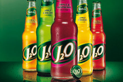
J2O - mostly bought for children in pubs

Jarritos - originating in Mexico, rare find in the UK gives it a kind of cult following
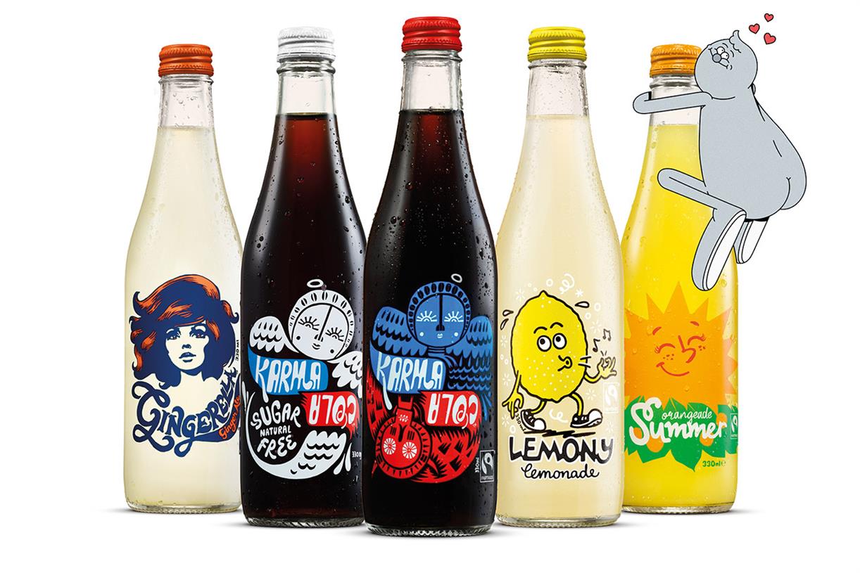
Karma cola -
Sketches of typography ideas:


Also, I originally was planning for the drinks to be packaged in cans, however I am now considering glass bottles because they are more sophisticated and provide a nicer drinking experience - they are also a collectible item - lots of people keep nice glass bottles to display or use as vases/ candle holders etc. If people want to collect the bottles, this strengthens the idea that this is a cult brand and can incorporate things like limited edition flavours/ bottle designs.
Existing soft drinks which come in glass bottles:

Fentimans - high end, expensive, sold in independant cafes/ bars, aimed at adults not children, focus is placed on the high quality ingredients used. Packaging is reminiscent of victorian tonic drinks.
J2O - mostly bought for children in pubs
Jarritos - originating in Mexico, rare find in the UK gives it a kind of cult following
Karma cola -
Type
We did a task where we swapped files with another person doing the same book as us. I was working on Elisabeth's files; she thought her strongest cover designs were the type only ones so I focused on those. After working on Elisabeth's type covers, I reaslised I wanted to focus more on my own typography. I remembered a study task from a different module where I had a made a grid from the golden ratio. I realised I could apply this idea to this current module as the golden ratio appears in nature and maths and is mentioned in the book several times.
Previously, when reading about the Marber grid, I found out that it is based on the 'golden ratio', aka the fibonacci sequence, a concept I explored in an earlier module on type. I thought it might be interesting to try this again and to take it further.
I made a grid of two overlapping fibonacci spirals and sketched out the letters of the title. When I was happy with the letter forms, I created digital versions of them in illustrator. The result is elegant and contemporary, which will hopefully make the book appeal to a younger and cooler audience.

Peer feedback mentioned the designer Eric Hu - I will look into his work to see how I could possibly apply his design principals to my own work.
Tuesday, 11 February 2020
Contemporary Book Cover Design
Na Kim on her process:
We have some form of manuscript pretty much every time. Sometimes it’ll just be a proposal, but usually there’s a first draft read I can read for reference. For fiction I pretty much read the manuscript from start to finish, but with non-fiction I find it easier to work when I have a general outline of what the book is trying to say. Obviously’s it’s harder to work on a book that you don’t like, because you lose interest in it. But it can be equally difficult when you’re really invested in a book personally, and get an idea of what it should look like in your head. If that sketch doesn’t get approved it can be really hard to let go of.
I usually take notes while I’m reading, and I don’t really approach it like a book I would read for fun. You’re looking for things that stand out visually, and can serve as metaphors for events or characters in the book. I try to sum up the book in three words and figure out descriptions that help me start seeing how I want to approach it.
There’s books where you immediately have an idea. You get this one concept, or vision, in your mind, and that can be pretty exciting. There’s a book that will be published in the fall of this year, and it’s a memoir by Tegan and Sara called High School – even just the title can evoke a lot of emotion and moods. That was a book where I had an idea instantly, and really pushed for it, and it happened to work out.


Kafka Covers:
I remember that my first reaction to seeing these covers was one of crushing disappointment. Disappointment caused by the realization that, as a book designer, I could never have arrived at such a brilliant and brave solution.
Launched in 2007, the covers – a collaboration between creative agency Mother, and Penguin Press Art Director Jim Stoddart – feature the work of Gary Card and Jacob Sutton. Crucially, the images were not originated for use on the covers but were created independently by (the now hugely successful) Card and Sutton shortly after graduating from Central Saint Martins. Interviewed recently in Varoom! magazine, Card recalls that the photographs were produced in Sutton’s bedroom and that, at the time they had ‘no idea what we were making’. He isn’t even sure how the images came to the attention of Mother/Stoddart, who repurposed them to such spectacular effect for the series. For Card, now a set designer, it was the first commercial use of his work.
The covers present us with scenarios so thrillingly bizarre, they resonate with even the most superficial awareness of Kafka’s writing – which in my view, is part of their success. As a set of images, they have an almost oppressively flat tone – I can’t help but imagine them to be the documentation of some dangerous form of nineteenth-century institutionalized therapy. There is a sense of deranged urgency about the way the props have been created and applied to the model. The honesty of the materials and the crudeness of the making seemed so progressive compared to the contrived book cover photo shoots I was used to being involved with.
This naïve quality is also reflected in the lettering, which dispenses with the author’s first name and instead presents four variations of hand-generated ‘Kafka’s together with accompanying titles. I’ve always loved that the lettering itself looks vulnerable – it seems to reinforce a sympathetic response to the subject of the images. For me they are a perfect package of playful exuberance, experimentation, creative serendipity and risk-taking, and in an age when we are so quick to tire of visual devices, they have lost none of their freshness.


Monday, 10 February 2020
Development
today i was experimenting with balloons again. tried to get action shots of the balloon popping but couldn't capture it on camera. Scanned one of the popped balloons and it ended up looking like a question mark which was a cool coincidence. I am happy to go forward with the balloon concept but feedback from the crit mentioned that the typography needs to be more thoughtful than the current mock ups.


Friday, 7 February 2020


Subscribe to:
Comments (Atom)