Wednesday 30 October 2019

Type in Context

After modifying my typeface, I have created a series of posters for the exhibition. Using elements taken from the artworks, which I was initially going to use to create a modular typeface, the poster's all share a 6 part grid, each section featuring type or an 'icon'. The elements switch places throughout the series, showing that there is no hierarchy. Each aspect of the poster is just as important as the other. The posters look playful yet still sophisticated and are designed to spark intrigue and make viewers feel welcomed.


Finished Typeface

After my experiments involving printing my typeface, I realised I didn't like how clean and sharp the lines were. In order to humble it slightly, I have hand cut the letters with a stanley knife and scanned them. This is the end result:


The difference is subtle, however these new glyphs feel much more friendly and approachable, which is the whole point of them.


This is the updated logotype:
 
I knew something wasn't quite right before, and now I know that it was my letter forms looked far too rigid and sharp. This new logotype has much more of a relaxed personality. 


Research

I have been reading Design as Art by Bruno Munari. The chapter 'The Shape of Words' has been particularly useful to my current typography project. In it, Munari talks about how the form of written/typed words affects how the viewer reads them; slowly, quickly etc.

Friday 25 October 2019

Logotype in context: Experimentation

Used scanner and printer a lot today to experiment with logotype for a poster.


Review on Logotype - Crit

Mixed feedback on my logo type - some said the 'tone of voice' is wrong for the exhibition, some said it was right.
However, I think it's a good sign that some people thought the tone was off because the intention behind the type is to change people's feelings towards the exhibition and make it seem less cold and unapproachable, which this type face does through hints of humour and childishness.

I tried applying the hierarchical grid used in the glyphs to the layout, but it looked ridiculous.

The overall balance of my logotype feels right to me, however the letters themselves are not quite right yet. There is something annoying about them.

When I come to designing posters I will apply the hierarchy to the layout and see if that works.

This is the finished logotype:


It looks fun and un-intimidating which was my aim, however it still retains a sense of irony criticising the exclusionary hierarchy found in the world of fine art.

The 'pupils' of the 'eyes' will be able to move freely, allowing them to interact with their environments depending on which context they are placed in.

The 'eyes' in the typeface, however, will remain fixed looking at each other. They represent the tops and bottoms of the hierarchy. The bottom eyes stare back at the top eyes defiantly, refusing to be intimidated. 

Monday 21 October 2019

Logotype

Leading: Space between lines of text
Kerning: Space between letters in words
Tracking: Uniform space between letters in words

Development of logotype


Taking my finished typeface, I tried different ways of laying it out to create a logotype.


Trying different combinations of upper and lower case
The differences in word length make it difficult to get the logotype to look balanced.
I prefer the logotype in upper case. It demands more attention and looks more balanced than the mix of upper and lower case. 


Using one of the shapes from the modular typeface, which is originally from a piece in the exhibition by Xiuching Tsay, to add to the logotype and to replace the 'oo' in Bloomberg and the 0s in 2020.

The counters in these shapes will be allowed to move freely, meaning they can interact with other design elements and be animated for digital platforms. 

Merging of 2 Concepts

combined the 2 ideas i have developed
the counter is floating and can move wherever
different on every poster
looks like eyes


Saturday 19 October 2019

Notes on Helvetica (Documentary)


In conclusion, Helvetica, here a metaphor for modernism, can be brilliant but also boring depending on the context. The postmodernist movement of the 90s/2000s was a rejection of conformity and whilst some great work came out of it, it wasn't always practical or aesthetically pleasing. I think it is important to experiment and come up with new ideas when designing, but to also remember what we learnt from the modernist movement.

My overall takeaway from the documentary is that there is no singular correct standpoint when it comes to graphic design and that it's important to develop your own opinions in order to create work with integrity.

Thursday 17 October 2019

Idea Development Post Crit

After having a crit with Ben, I am taking my work in a slightly different direction. Before hand, I was almost mocking the exhibition for being too esoteric and was planning on creating a satirical type face. However, I have now decided that I want my type face to invite in those who may feel intimidated by the exhibition and make it accessible to all. My type face will about how gallery visitors interact with the exhibition, and about how even though there are structures of hierarchy in the art world, every one is welcome to be part of the discourse around modern art.

This has lead me to a few different outcomes.

Below: This typeface is made from modular forms found in the artworks themselves.  The exhibition didn't display any information about the intentions behind any of the pieces, which made me feel isolated as a viewer. 
This type face invites viewers to look closer at the pieces exhibited and to find familiarity in them. The idea behind it is that everyone can find a meaning in art, no matter how abstract it is.


The below type experiment was created by imagining a floor plan of the gallery and following the directions that people walked, where they lingered longest, what they circled back on, I was able to create a sort of map. After mapping out these imaginary lines, I could trace parts of them to find letter forms. These letter forms were then experimented with further in illustrator. 


The typeface I am developing now is based on a hierarchical grid, where the top quarter is disproportionally larger than the one under neath it, which in turn is larger than the quarter underneath that and so on. However, the font is only legible when all 4 quarters are included. This represents how the general public may not have as much input into modern art discourse, but it is important just the same. The end result of using this grid has created a font which looks part playful part serious, cheeky yet approachable. You almost feel that it's laughing, but are reassured that you are not the butt of the joke. (Note not all characters are completed, this is still a draft)


The Harvard Referencing System - An Example

'For centuries, 'branding' was little more than the signature of proprietors on the corner of their packaging; the word 'branding' didn't mean what it has come to mean now.' (Johnson, 2016, p. 13)

Sunday 13 October 2019

Bloomberg New Contemporaries: Idea Generation

I now have the intention behind my type and I know what overall 'vibe' I want it to have, but I am still thinking of ways to create the physical letter forms.


Inspired by Renie Masters' piece in this exhibition, an initial idea of mine was to look for letter forms in broken china, however this idea only relates to one art work and isn't representative of the show overall.


I have started by looking for shapes in the artworks themselves, seeing where letter forms naturally appear to me and creating an alphabet from this.


I think this is a good start but it definitely doesn't feel fully realised to me.


I want to keep in mind that the typeface doesn't necessarily have to be made from flat black vectors - type can be made from anything be it toothpaste, shadows or negative spaces in household objects.


One idea is to poll members of the public who visit the gallery and generate a typeface from the feedback they give me, maybe by asking them to draw a shape expressing how the exhibition made them feel. I need to develop this idea further, as my criticism of the exhibition is that it's slightly pretentious and inaccessible to 'non-arts' people, I don't want this method to potentially alienate people further, or for them to feel under any pressure to do something 'profound'.


Another idea is to create a typeface which is so pretentious it is completely inaccessible and unreadable, but I don't have any rules to specifically create this.

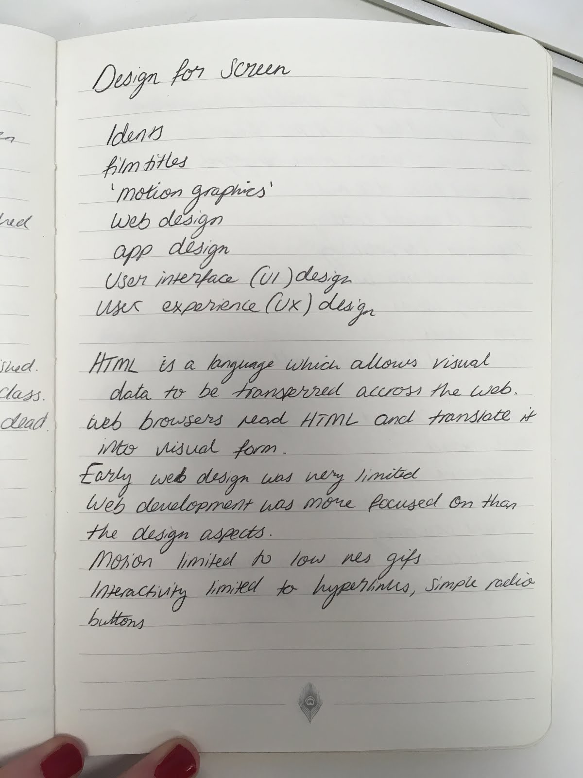
I am also thinking about creating a typeface using the traditional artistic processes used in the exhibition such as sculpture, paint, photography etc. and then continuing to process it in different experimental ways to create something contemporary.

My overall themes are 'accessibility' and 'hierarchy'. 


ACCESSIBILITY
the quality of being easily understood or appreciated.


Interview with Jordan Watson in Forbes. Wattson runs an IG page (@love.watts) curating modern art that he likes. 
“Growing up in New York; young, poor, and, black; I did not have the opportunity or exposure as a child to appreciate art, let alone be a part of its community.  With whatever platform I now have, I want to make sure that I am providing that opportunity and exposure to as many kids out there as possible.”


My housemate: “I don’t like going to art galleries because the plaques are so small and I have bad eyesight”


My dear friend Eleanor: (on modern art) “If we explore the function art plays in human society and the reason it’s been vital to our continued survival that’s like as far as you can get from some emotionally distant objects locked in a fancy inaccessible building which fail to resonate with the bulk of humans.”


HIERARCHY

a system in which members of an organisation or society are ranked according to relative status or authority.

also visual hierarchy - this relates to layout, which elements go where on a page, how much space they take up. This usually is decided by the order in which the viewer should look at each element. Look at newspapers for example. They generally have a clear visual hierarchy with the headline taking up the most room and usually in a bold typeface as it is intended to be read first, followed by the strap-line, the paper's name, then article text, images etc.


As I am exploring hierarchy in the fine art world, I will apply the visual hierarchy to my designs as well as breaking it down e.g having the less important information on a poster take up the most room with the exhibition title being small and at the bottom, as this challenges established hierarchy.

Friday 11 October 2019

Research for Brief: Bloomberg New Contemporaries

About
Exhibition has been on, in some form, since 1949
First year it's been in Leeds
Showcasing work from 45 up and coming contemporary artists

My first impressions

Lacking explanations behind the artworks
Everyone viewing the works seemed a bit uncomfortable
No one was telling us what to think so we didn't know what to think
The art felt inaccessible
I liked some of the art but some pieces felt too pretentious. I think it's ok to be pretentious to a degree, but when you isolate 90% of your viewers, it's too far.
The pieces I liked the most were the satirical ones.

The building housing the exhibition is very interesting, dating back to the 1800s. They have a traditional collection along with pieces by contemporary artists such as Damien Hirst.
The exhibition it's self was housed on the first floor of the gallery, up a grand staircase. The room differed greatly to the classical collection downstairs; it was a lot more sparse and airy with lots of natural light in the space. The high ceilings and large open spaces made me feel like I was somewhere very important.

I want to create a typeface which is both inaccessible and sarcastic, that will say to art lovers: 'here's some of that weird art stuff you love' and will say to those less well versed in art: 'it's ok. i don't get it either'


I understand this is potentially a controversial view point and would like to say that I am not disrespecting any of the artists, I am simply reacting honestly to my first impressions.


Photos from gallery visit: notice minimal information on placards.

Some photos from the catalogue - this was very useful as it enabled me to understand why certain visual language has been used in the individual artworks.
photo of exiting typeface of LAG for reference.

Out of the 45 pieces in the exhibition, 9 are photographs, 15 are 'traditional' art methods eg paint or pen, 8 are sculpture, 9 are audio/visual and 4 are 'other'. This was interesting to observe as it shows just how varied the exhibition is. 


There are notes in my sketchbook with my reaction to each artist's individual work.

Here is a screenshot from the BNC website:
It's extremely minimalistic and simple, with an interesting pop of neon pink on some of the text. 


When google searching BNC this image also comes up:


It only appears in one place and is the closest I can find to an existing logotype.


There are pages on the BNC website containing a lot of information about the exhibition, which I have found useful to gaining an understanding of what the exhibition's intentions are. The whole point of the BNC exhibition is to give a voice to emerging contemporary artists who may otherwise struggle in getting their work seen. BNC has been established for a long time (since the 1940s) and is well respected as an institution.