However, I think it's a good sign that some people thought the tone was off because the intention behind the type is to change people's feelings towards the exhibition and make it seem less cold and unapproachable, which this type face does through hints of humour and childishness.
I tried applying the hierarchical grid used in the glyphs to the layout, but it looked ridiculous.
The overall balance of my logotype feels right to me, however the letters themselves are not quite right yet. There is something annoying about them.
When I come to designing posters I will apply the hierarchy to the layout and see if that works.
This is the finished logotype:
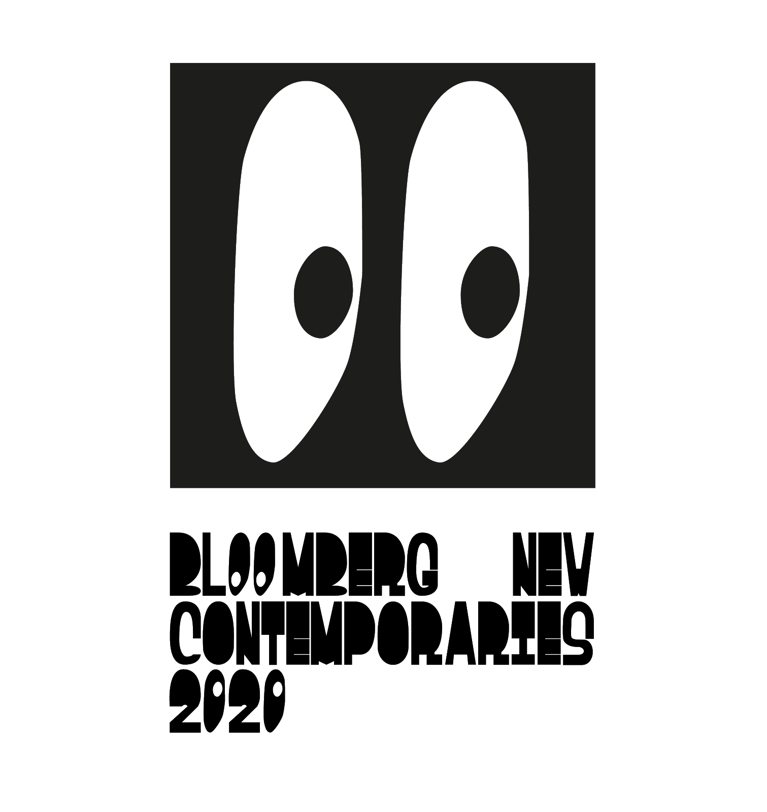
It looks fun and un-intimidating which was my aim, however it still retains a sense of irony criticising the exclusionary hierarchy found in the world of fine art.
The 'pupils' of the 'eyes' will be able to move freely, allowing them to interact with their environments depending on which context they are placed in.
The 'eyes' in the typeface, however, will remain fixed looking at each other. They represent the tops and bottoms of the hierarchy. The bottom eyes stare back at the top eyes defiantly, refusing to be intimidated.
No comments:
Post a Comment