Thursday, 29 October 2020

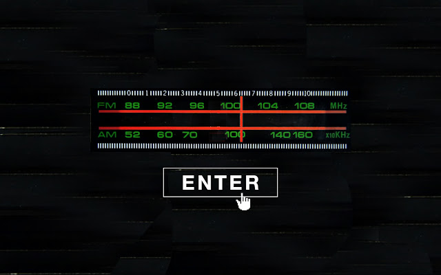
mockups - landing page

using imagery of a traditional radio - the user must 'tune in' to access the site 


use mouse to drag dial left and right

enter button only appears once dial is tuned to correct frequency


same concept visualised differently


consideration - do I want this to be more of a 'VR' style experience, where the user can look around and it appears they are in a physical space which they can then interact with? i think whilst this would be cool, its a little too literal and i would prefer to go with a 'stylised' website.


nightclub scene from GTA - a video game style with sei realistic rendering could work?? I wouldn't know how to make this though


501 Lecture

Understanding the context behind visual references - what is context?

Questions that can be applied when analysing images:

1. Idea/purpose
What is the image about? What does it mean?

2. Form
What is happening in the image to communicate these ideas?

3. Idiom
What is the specific visual language of the maker(s)?
What makes their work look like their work?
Typography?

4. Structure
How have choices in composition helped to convey the idea?

5. Craft
What skills, processes and materials have been used to achieve this?

6. Surface
Consider how these steps work together to create an effective final image

Our image:

Promotional poster for the sex pistols made through collage.  It was made for a younger target audience in order to convey anarchy attitudes and controversial anti establishment themes which had a controversial reaction. This is shown through Jamie Reid's classic style and covering of the queens eyes and mouth

structure/form/craft: collage using black and white image of the queen with a bright union jack in behind. the queens eyes are mouth are ripped off to establish the idea of abolishing the monarchy which is a big part of punk ideology during the time. The contrast of the bright flag takes focus away from the queen, and as this was created during the time of the queen's silver jubilee it was quite controversial

Reid's idiom of using type collaged from newspapers makes his style recognisable, it could be commentary on the state of the British press at the time. Reid dehumanises Liz by covering the eyes and mouth, showing a lack of respect. There is irony in the image - without context and at face value, it is celebrating Britain and the monarchy, however with context given it is clearly subversive and anti-establishment.


Visual identity - current 'pirate radio stations'

Balamii - "Balamii started as an app, delivering mixes recorded in London’s clubs to your phone. Since 2014, it has grown into a radio station that produces events, video and written articles. We remain true to our original spirit - Balamii is a community of like minded individuals passionate for underground music of all kinds. We discover musical gems of the past, support rising talent of today and help foster the future of underground music. Our output is varied and expansive - Balamii delivers radio, events and video to a global audience hungry for the same things we are."


 BBZ instagram - people centred, DIY


Boiler room - boiler room began as a live stream via a webcam, literally in from an old boiler room in a warehouse. the original logo was just a scan of the original 1930s boiler room sign. when they gained popularity, designer Adam Tickle who had experience designing record sleeves/ flyers/posters for bands designed the current logo.
"He convinced everyone to use the final design (a simple circle emblazoned with the name in Univers 93 Extra Black Extended) by explaining it as a cross between a Technics slipmat and the Pure Garage logo."
"The setup of a Boiler Room event, wherein the DJ faces the camera with the audience behind, left space for imagery in the background. The guys decided to add a big video projector screen to the mix during live broadcasts, and filmmaker Cieron Magat started placing the logo atop old rave footage – Tickle, who now works as Design Director at creative agency HarrimanSteel, thinks that’s when it really came into its own. “It was constantly flashing in your face and hard to ignore,” he explains. “It had this all seeing eye, ‘big brother is watching you’ feel to it.”"


They sell duct tape for some reason? hype beast boys will really buy anything with a logo on it i guess


https://daily.redbullmusicacademy.com/2016/01/london-music-logos-explained


Rinse FM - "Rinse FM is a London-based community radio station, licensed for "young people living and/or working within the central, east and south London areas". It plays garage, grime, dubstep, house, jungle, funky and other dance music genres popular in the United Kingdom."

Originally a pirate station, Rinse became licensed in 2007.

"Lockhart, who still serves as the station’s manager today, thought that a fixed-up, professional look could potentially help Rinse snag a license. Up until that point they couldn’t market the station (apart from club nights and DJ compilations) for fear of legal repercussions, but were now ready to fight for legitimacy. In 2006 she approached graphic designer Stuart Hammersley, head of a studio called Give Up Art, to create a new logo. "

"“I remember saying to Stuart, ‘I know we’re just a pirate, but I’m gonna get a license. We’re gonna become a big thing. And I want [the logo] to be able to stay the whole journey, and I want it to do the talking,” "

"Lockhart and her team are still in love with their logo and its cross-genre appeal; they consider Hammersley the station’s brand guardian. The ‘R’ has even been spotted shaved into people’s heads at Rinse events. "


NTS radio - I tune into this one a fair bit after being shown it by a friend - it has a very broad range of genres to choose from, but it makes them all feel very accessible even for first time listeners.


On all of these sites it seems important for the artists to be able to showcase their own brands - from the live stream set ups on Boiler Room to the mix covers on NTS. Giving the artist space to display their own graphics help to fully immerse the viewer in the experience of the music.


Thursday, 22 October 2020

Postmodernism

 what is postmodernism??

- lack of naivete - self awareness in every stylistic choice

- referencing - pulling elements from many other recognisable sources and combining them to make something new

- 'pastiche' 

- parody

- irony?

postmodernism is a very broad movement which affected many areas of culture form philosophy to architecture and is notoriously difficult to define

i personally love postmodernist design as it is self aware and often humorous, and shows that the designer has a broad understanding of pop culture, art, and design as a whole. theres a very 'wink wink nudge nudge' element to it - perhaps people like postmodernist design because it makes them feel smart for recognising its references?

postmodernism seems to acknowledge that the world is messy and far from perfect, but instead of taking a defeatist attitude it pokes fun at our modern society

in general, postmodernist design is a rejection of the minimalist 'modernist' design era which preceded it

from the Tate: "Postmodernism can be seen as a reaction against the ideas and values of modernism, as well as a description of the period that followed modernism's dominance in cultural theory and practice in the early and middle decades of the twentieth century. The term is associated with scepticism, irony and philosophical critiques of the concepts of universal truths and objective reality."

examples of postmodernist design:

The Memphis group - Italian based design collective making furniture and homewares in the 80s - their over-the-top use of colour, pattern and form has come to define the aesthetic of the 80s.

"At the time, objects were usually designed to be functional, not decorative. Memphis changed this with a more creative approach to design, where they poked fun at every day objects by designing them in a way that was unusual."


why is postmodernism important to me as a designer?
I feel that designing in a postmodernist world, it is ignorant to not understand the references you are making in design. it is important to understand cultural and historical context.


References - 

'copying in design, hannah carlisle'

'susan sontag, notes on camp'


Wednesday, 21 October 2020

Image manipulation

 !!!The content of the image isn't too important, its the ways it can be manipulated to change the idea it communicates.

I have thought about my website conceptually a lot, but haven't given too much thought to the actual production or visual language. I need to consider how my idea can be transformed from a concept into a physical website, and how my ideas can be communicated through graphic elements.

im going to use some existing photos i have from my film camera and apply different processes to them to see how that can change what they communicate.

in terms of colour choice for the website - i think it needs to be dark to emulate the experience of being in a nightclub. not pitch black, but shadowy. I can also incorporate some bright/neon elements to suggest the lighting often used in clubs

eg


a lot of the experience of the website will be audio so i think the visual elements need to be simple so that it isn't overwhelming. 

idea - light moves around the screen in time with beats/ randomly/ follows mouse cursor.


cropping images from inside nightclubs to focus on the lighting - all from film camera so very grainy, really nice colours - not flat at all

adding blur - problem of pixelation fixed

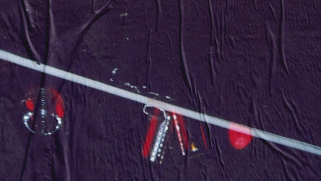
another idea i cant do right now - paste images up on boards like flyers and then photograph - so will have the texture of the paper and the ripples/bubbles you get with paste ups - will make a mockup 


This ^ as the background of a webpage would look good, with some type and navigation, and light trails from the mouse cursor


perhaps the paper texture overlay isnt even necessarry - the images are good on their own.